yup, i’ve missed this, my bad. very nice! this is the ideal size for my needs! (at least it is much much better than the big ones).
thanks!
yup, i’ve missed this, my bad. very nice! this is the ideal size for my needs! (at least it is much much better than the big ones).
thanks!
Agree. But the thing is - Blynk was never designed for the Tablets. And thing is - it requires the additional team and we can’t afford that.
That’s not true. Every proposal and complain is considered and discussed within Blynk team.
So far at least… Blynk already works just fine on Android tablets… once you juggle the font size 
I know my ears were itchin I suspect the reference was more about how once an arbitrary decision is made it tends to stick, regardless of comments or complaints against it. Mistake are made, and best owned up not covered up…
But you guys do a good job of listening to and fixing most bug reports 
I 'm looking for an APP witch could split the screen in 2 parts in lanscape mode
this will fill the big void left by Blynk for tablet users
Do you mean something like Android Multi-Window or something else?
yes for lollipop
Multi-window support is already implemented, but it needs some more testing before it will be released, we have too much screens for it to work correctly and the number of screens is always growing =(
it is nice to hear 
I think it will be a good solution for our tablets
The 2.26.6 update resolved the home screen button widget issue. Thank you!
I think You blynk guys are doing fine, your app is the best out there, nobody comes close as far as a customizable app to control your world.
Hi Dmitriy,
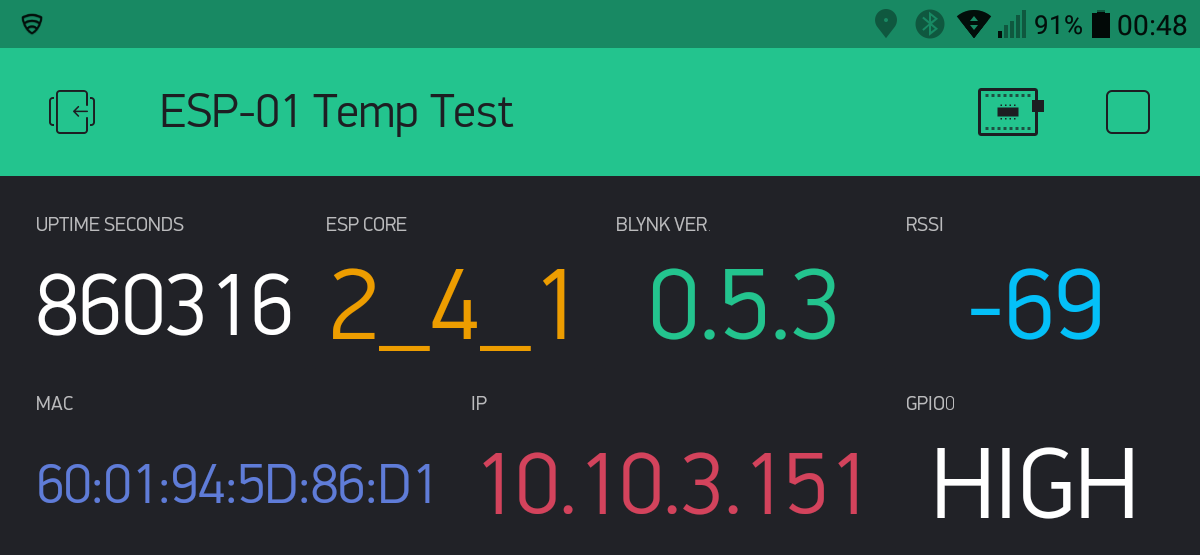
While a tablet app would be good, I was not expecting that. The issue that I am having is inconsistency of text presentation across a range of devices. I have done further testing as follows:
It would be great if the same number of characters could be achieved on different devices which I think is what you are trying to achieve - same appearance irrespective of device. The problem does not appear to relate to screen pixels as the Motorola Razr M shoes as many characters as the Pixel.
The word wrapping on the i-phone is interesting.
I have tried smaller settings for screen size and font size on the Lenovo but it didn’t make any difference to number of characters.
If the small font option allowed, say, 12 characters per quarter wide value display irrespective of device I think that would probably meet a lot of needs.
I know I can develop different projects for different devices to get around the problem. There is also the option to combine information sent to the app and display it on half wide or wider value displays (wasting less space on margins). However it would be much better if one could have a screen design that displays the same across a range of devices.
It seems like the change to fonts has been a significant technical struggle for the Blynk development team. Hope it can be gradually perfected to achieve consistency.
Again, thank you for developing and making Blynk available. I love working in the Blynk environment - great flexibility, unlimited alternative ways of doing things etc etc.
David
In my tests across my multiple phones and tablets it is the DPI that seems to affect the look across devices more so than the resolution.
Not to long ago we had exactly that end result… automatically scaling text across all devices. Unfortunately, I decided to request that the LABEL, TAB and Terminal text, along with a few other minor visual quirks including the Tiles, get looked at as they were NOT scaling properly.
Unfortunately, what happened is Blynk seemingly ignored the point I was referring too, and removed the auto scaling!
End result, uglier than I imagined… and effectively ruining the look and function of many of our projects.
It still has many benefits, however if this issue is any indication, then changes may ruin that flexibility in favor of conformity.
@dmorph1, The funny part is, some individuals are in position, that it looks better now!! I’m trying to be on neutral ground, as my screens have not suffered that much (and looks better on old, lowres tablet, worse only on my NOTE4 ), yet still I’m missing the option to choose…
I can’t recall anyone clearly stateing/showing how it looks better? The closest I can see to a limited improvement is that decrease in “air” that makes room for a larger font on the Styled Button… the rest still looks crappy.
Auto Font
Fixed Font - Best fitting font size chosen
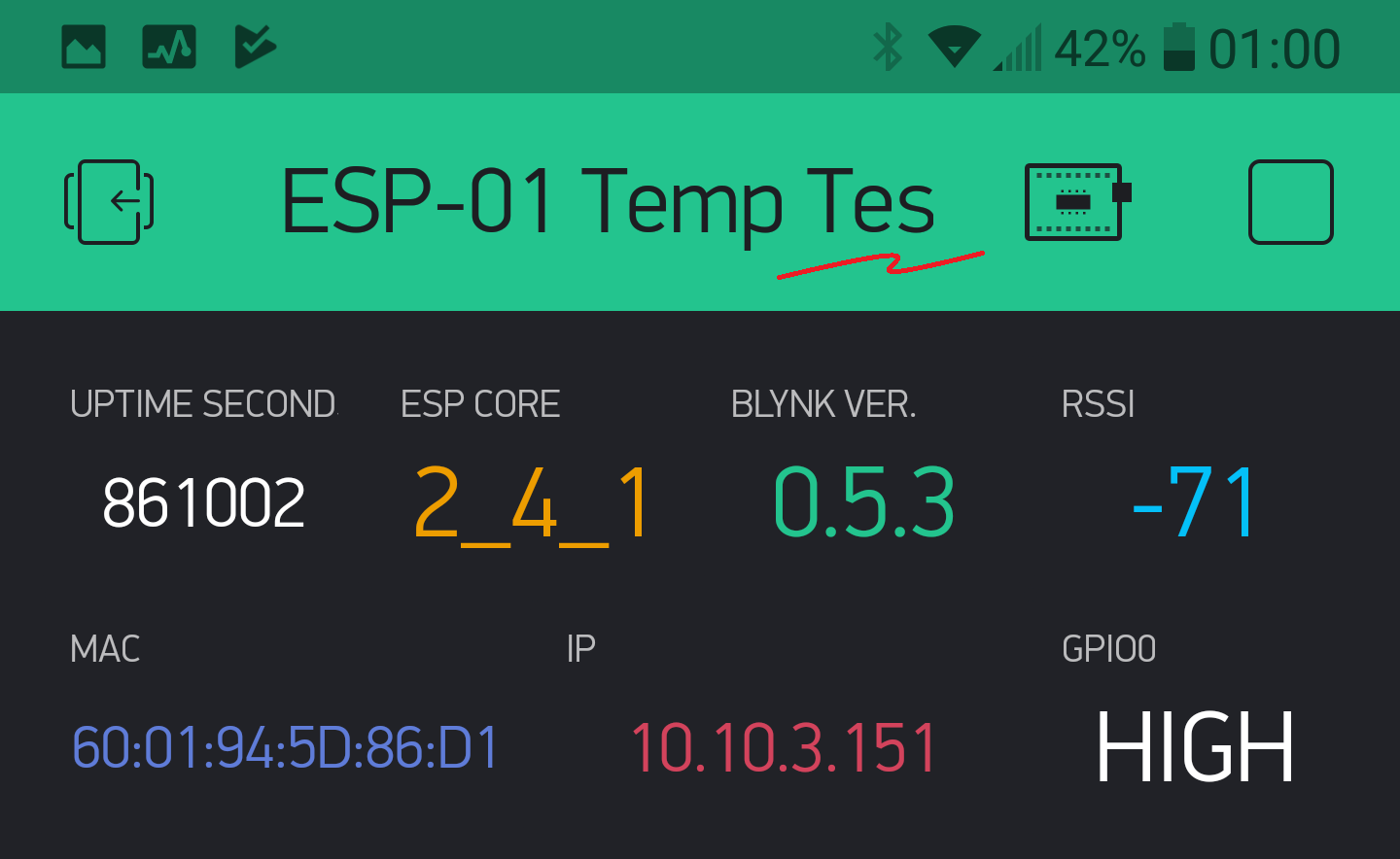
And further comparisons… just in case someone forgot what Auto fitting fonts did for us …
LG G6 - HD 2:1 phone
1st Auto then 2nd Fixed font (tweaked to fit as best able)
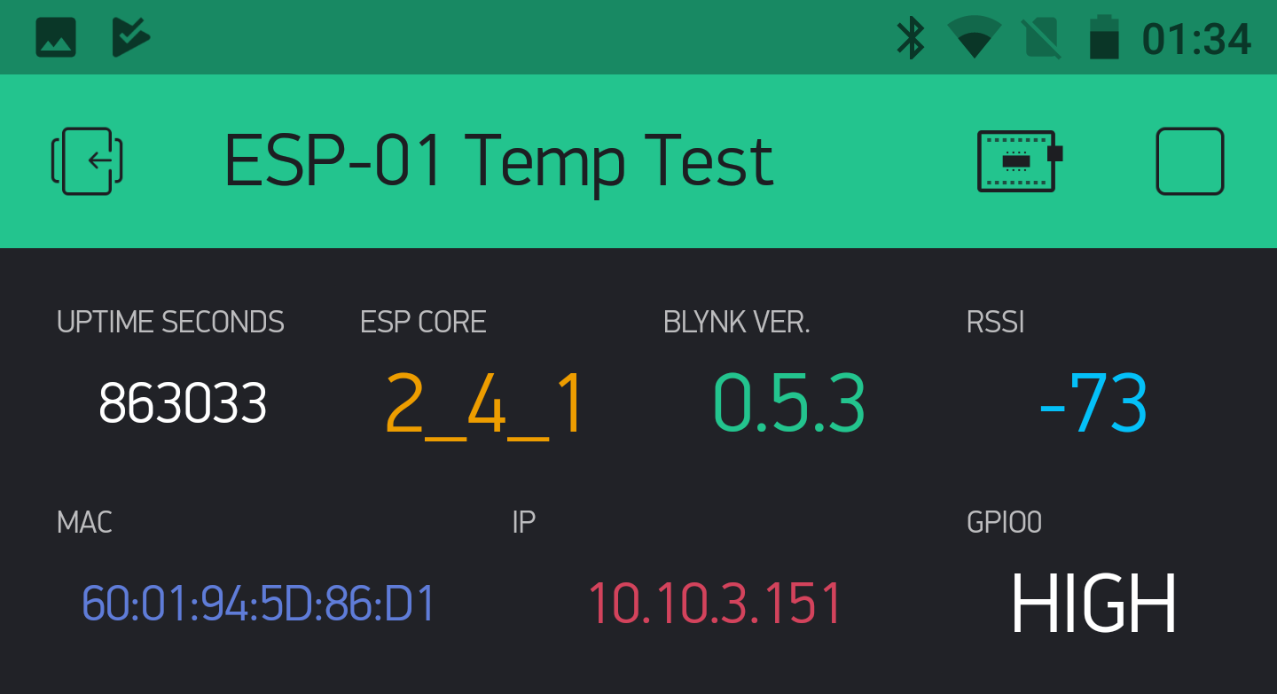
Nexus 6 - HD 16:9 phone
1st Auto then 2nd Fixed font (same settings LG G6)
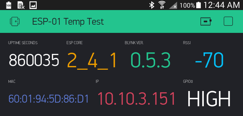
Samsung Note 8 Tablet
1st Auto then 2nd Fixed font (same settings LG G6)
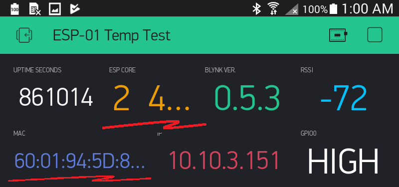
LG V533 Tablet HD
1st Auto then 2nd Fixed font (same settings LG G6)
As should be obvious… while both end up with differing font sizes across the project, the autoscale just fit, while fixed fonts need tweaking for each device (and often layout adjustments to fit), which would usually crop text for any other device using same project.
And this is when using mostly fixed size string data per widget… look out if you have widely variable data sizes 
Correct, text containers grow with text there, you don’t see truncations there. What’s more important, you can set any font size there, event tiny one, not just 3 options.
And anyway, my blynk project is personal use, not public, why not allow to setup my own preference? My preference is to be able to see all info on my screen at once, without scrolling. I had it, but now it is impossible, event with your smallest font option.
the more basic button is “ENTER”
but since new release, text can’t fit in the button because of the too large margins !
OK I assume that “ENTER” is 5 letters but why “START” fits in ??
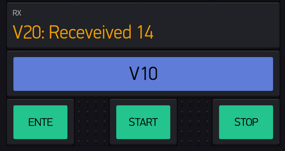
Probably based more on pixel length. Thanks to how the A squishes in unter the T in START, it just squeaks into the “allowed” size
or ENTAR