Blynk on Tablets vs Old Phones vs New Phones

While it certainly might be true, I do like how it looks on my “not-so-new” Note 4 :stuck_out_tongue: , but I do agree: Blynk looks already quite good on tablets (well, not all) , yet the problem is the orientation, which is currently locked to portrait… But on 7" it looks quite decent…

I think it is a good idea to move this into another topic, so I did :wink: … Much to discuss on the pro/cons and ideas about the difference and reasoning between Blynk’s current “official” purposed use on phones instead of tablets.

From a design side… I can see automatically adjusting the Blynk desktop from portrait to landscape as being a bit of an issue. How would the UI adjust the widgets?? Stretch them horizontally while requiring scrolling on the vertical? Arbitrarily move them around to fit? etc, etc… I can see all sorts of complaints that it wasn’t done right :stuck_out_tongue: thus I understand the reasoning for NOT doing that.

But other issues like how new HD phones can’t seem to scale the text and some widgets like LEDs properly, compared to older phones and tablets with 1/4 the resolution… that is what bugs me and keeps me from using my phone for Blynk unless absolutely needing to.

With which exactly widgets do you see issues on HD resolutions? In my opinion, we have a lot too small texts in the app, but not the scale issues)

Yep, long ago we made an app’s version that will work on portrait/landscape/screen_dividing, but it do not look good, because widgets are too large(

Yes, I’m sure this is the hard part… I was thinking about some restrictions, which - if not managed - would not allow to change the mode. Or the other “shortcut”: Choose ONE working mode (either portrait or landscape), and DO NOT allow to change it, once done. It could be then possible, but it is the user job to arrange the view “from scratch”. Then simple “Are you sure?” might be enough :stuck_out_tongue:

Can you post some screenshot? I do have Blynk on two screens with 4K (or so) resolution. On my phone it looks good (all my screenshots are from my phone), but on 9,7" tablet everything is “tiny” with a lot of empty space.
The problem with Android OS is, it is not only the screen resolution that matters. I’m a noob when it comes to Android app building, but I was playing once with files responsible for user Interface screen draw. A LOT can be done, and even more can be messed :stuck_out_tongue: So I do believe the way Blynk (among others) looks like is strongly dependant on those files and settings (the easiest to try is to change the dpi in build.prop on rooted devices)

I do believe, the best would be to make a selectable text size (a few to choice from, for example). The only really small text is on labels, but again: sometime it is desirable, sometime not - therefore it shouldn’t be fixed size.
As we are with labels: I miss the label for new split button widget… it is not there “by design” or some “oversight”?

Label text gets cut off (too large?), Tab text too large, showing less tabs, and I think the LED widget also changes scale

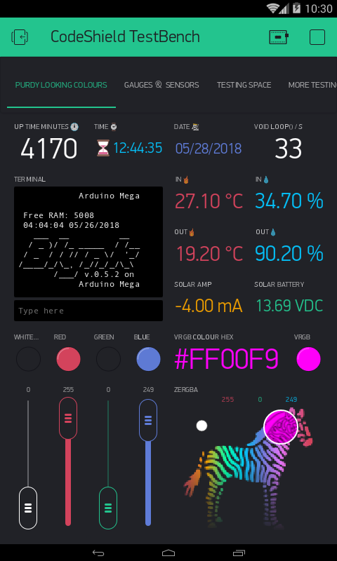
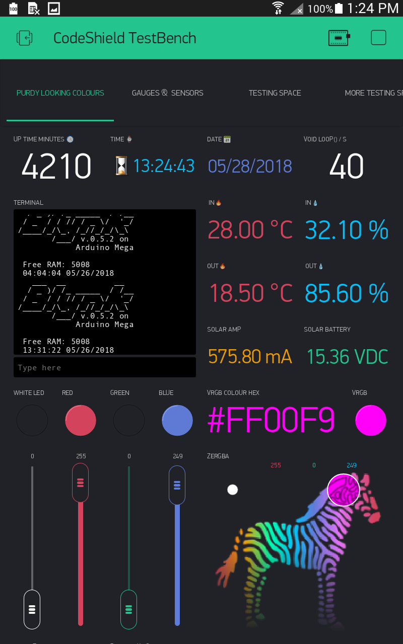
Here are four screenshots of the exact same project screen, only the emulator and tablet show everything more or less perfectly.

As for the two HD phones, both totally lose it in the Terminal text scaling and the LG G6 shows the smallest LED scale and loses the most Label and Tab text compared to the Nexus 6.

Device name and screen resolution in the image title.

Phone Emulator - 480x800 and Samsung Note 8.0 Tablet - 800x1280

Nexus 6 - HD 1440x2560 and LG G6 - HD 1440x2880
Note things like the project title bar and Tabs… both phones have exactly the same 1440 wide resolution, but the LG cuts off more info.

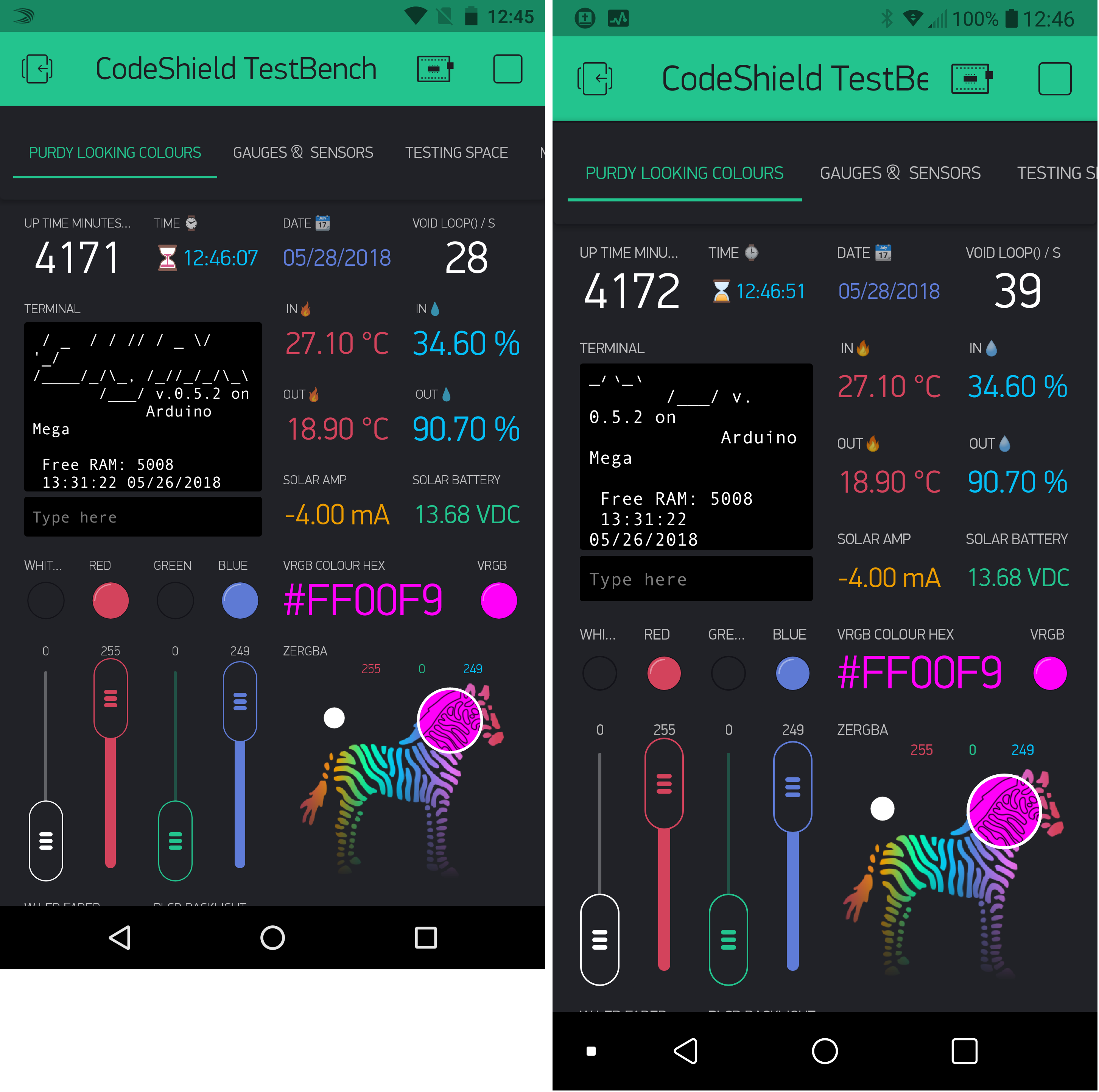
The LG also will not display properly in the forum… insists on scaling to width, probably due to aspect ratio? I merged the LG and Nexus into one picture to get a proper side by side comparison.

As shown, the higher the resolution gets, it seems the scale goes wonky and makes text too large, thus fitting less instead of more. Thing is these higher res screens are very sharp and clear… meaning smaller text can still be read… if allowed to show.

Now looking at them all side by side… it becomes more obvious that the scaling is trying to fit the exact same desktop into both X and Y axis…

For the newer 1:2 ratio phones, perhaps just scale to width and let the bottom show any extra space or widgets, if any (as there are on these screens) instead of trying to stretch everything out of square.

@Pavel is against auto-scale, so probably, we’ll fix this issue introducing font size selection, like with new widgets and old widget updates (in 2.24.0).

2 Likes

It is by design, we have plans to introduce some separator and label widgets without pins, just to show a line or some text.

2 Likes

And that would be a great, long awaited widget! :+1:

There is a lot of variation in phone screen size and resolution out there… but perhaps there is a technical reason to avoid autoscaling?

There is a purely economical reason.

Ah yes, the age old cost vs option issue. Understandable I guess (says the guy not paying the bills :wink: )

But looking at it from the old web designers aspect, scaling became essential to make a “project” useable as designed to all viewers formats.

An as I see it “free” Blynk is a designers platform that works on all phones, so the expectation when designing something on one device is that it will look the same everywhere.

But even now knowing that it may not, it still catches me off guard when I make a project that looks and works perfectly on my development devices, but as soon as I see it or show it to someone on the “daily driver” phone, it looks, well, not so nice :grimacing:

That all said… for me personally, I am just playing around and learning. So while I can (and do :stuck_out_tongue_winking_eye: ) complain and debate, I still understand that I get to play for free :smiley: So… Thanks!!

I only have one tile holding data, but this was a 3x1 grid and the exact same display on all three devices.

FYI…

On older tablet (Samsung Note 8.0) 800x1280

On older HD phone (Nexus 6) 1440x2560

On newer HD phone (LG G6) 1440x2880

:scream: enough to say it looks… Unacceptable on G6 (EDIT: and on “my” phones too- as attached) … I don’t know how, I don’t know what, but I guess something should be done to fix it…

Device tiles, Note 4 (UHD):

Device tiles Huawei P10 lite (FHD):

And some 7" Alcatel Pixie tablet (???):
Screenshot_2018-05-29-08-32-27

And who said Blynk is not designed to use on tablets? :smile:

Now how the hell do I install Blynk on my Phone?

https://i.ytimg.com/vi/spbTePuymbg/maxresdefault.jpg

2 Likes

If it has Android or IOS, It can be done. :stuck_out_tongue_winking_eye:

Not quite what I meant by dedicated numeric keypad widget… but closer :stuck_out_tongue:

@Gunner

Not sure I fully understand what’s wrong with the tiles widget on your smartphone.

If you are talking about cropped value, then you should use less columns in the tiles. Same for @marvin7

There are certain physical limitations of the screen real estate. You can’t put an elephant into a bird’s cage, no matter how strong you want it.