This is not normally how I write bug reports but after being forced to re-do a lot of my projects based on the old Blynk (for which I have bought quite a few ‘energy packs’) because it was decided that the new Blynk is worth a lot more money, and still the same bugs remain and some new are added… I can’t help but to add a bit of ‘sass’.
It would de different it it were an open source project maintained by volunteers.
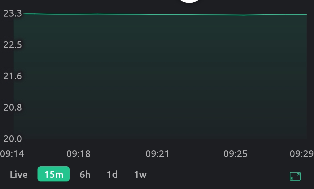
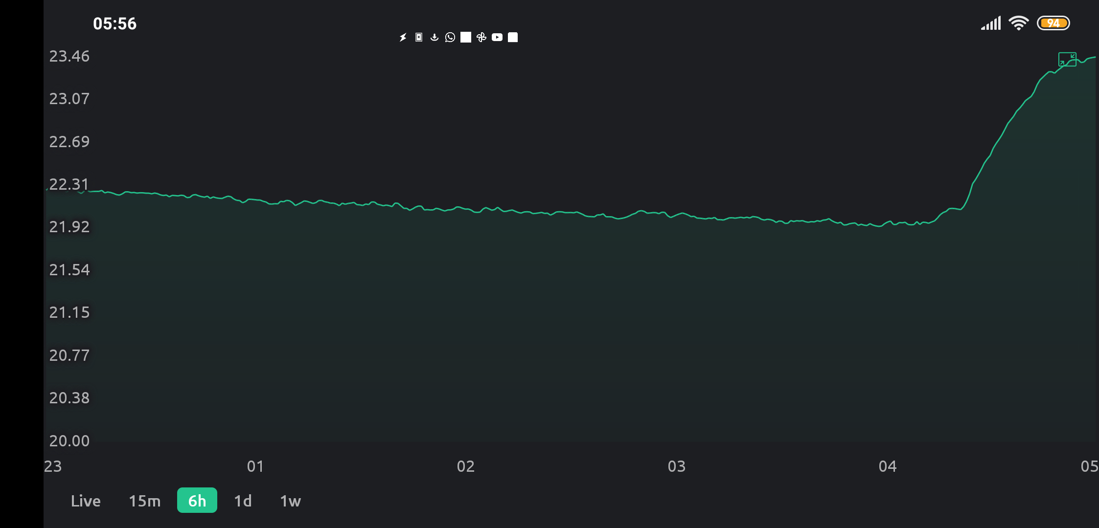
I’ve already tried to provide all the details I deemed relevant. I’m using Android and the latest available Blynk IoT. My sketch sends a new temperature value every 5s and as it’s previously calculated with a lot of averaging, it’s extremely smooth and well behaved (no sudden spikes or out of bounds values). Value is currently in the 23.2±0.5 range . When I do get to see the actual data on the graph (between all the bugs mentioned) it’s indeed smooth with no missing values (connect missing data points turned off) or sudden spikes. For me that means that the Blynk server has the correct data and so the actual sketch that sends it should be irrelevant.
OK, after further experimentation I’ve identified a switch that triggers the manifestation of most of the mentioned bugs: “Override auto scaling for all datastreams”. As I am using a single datastream on a chart (Free version, so can’t use multiple) I left it at the default (off) thinking it does not apply to my use case (a single stream).
With it set to ON and “Y-axis scaling” set to “Auto” these bugs remain:
Non critical:
- Non optimal and not consistent range selection:
On App open or initially after switching between the time bases, a needlessly large range gets selected making small changes impossible to spot. Needless to say, my expected behavior here would be to select the range in such a way to best use the available Y space to show the data.
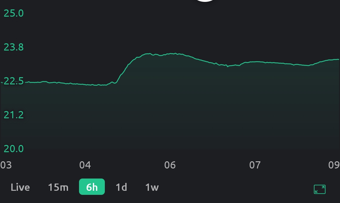
On the next chart update, the upper bound gets a better value, but the lower bound does not:
Critical:
- Both X and Y tick (labeled values) are chosen in such a way that they require rounding beyond what is shown on the labels and thus the labels no longer represent the actual values at that chart position (what I would consider a shocking “offence” for any even remotely respectable data plotting widget). Expected behavior: literally look how it’s done on any X/Y data plot ever.
With it set to ON and “Y-axis scaling” set to “MIN/MAX: 21-24” these bugs remain:
3. I can detect no change from the “Auto” position. This could be the expected behavior as I am not 100% sure what the “Override auto scaling for all datastreams” is supposed to do in such a situation.
With it set to OFF and “Y-axis scaling” set to “Auto” this is the additional bug on top of the ones mentioned before:
4. only after switching between the time bases is a sane(ish) auto range initially selected:
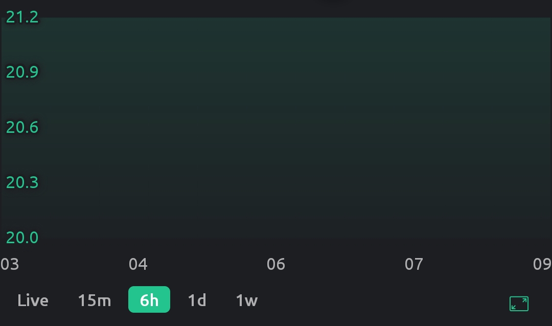
Then on the next chart update (so after a couple of seconds, depending on the time base selected), without fail, a completely wrong range gets selected usually containing no actual data points:
The same happens when the chart is shown the first time the App is opened and the only way to (temporarily) fix it is to change to another time base and back. After a few seconds the range again gets selected incorrectly.
With it set to OFF and “Y-axis scaling” set to “MIN/MAX 21-24”:
5. The range no longer seems to be Auto-ranging but neither is it what I have requested. Initially it’s 21-23 (cutting off a lot of the values) and only after base change it changes to 20-25 (still not what I requested but at list all the data is shown).
I am willing to provide more data but only what the actual code maintainer deems necessary. As I am using the latest Blynk App and libraries, only a single SuperChart widget with only a single datastream on that widget, with a VirtualPin update rate of once every 5 seconds and a very well behaved value, I would be very surprised it this is some obscure, never seen before and impossible to replicate behavior.
EDIT: Ok, I think I (partly) understand the rational behind the issue 2. Rather than selecting the optimal range for the data that is currently shown, the range is selected based on all of the data saved on the server as it was the easiest way to implement the data scrolling but at the significant Y resolution loss at shorter time scales. I would gladly turn off the ability to scroll it that meant a better range selection for the actual data currently shown. It still does not explain most of the other issues.