Could you please make the shown tick values actually sane?
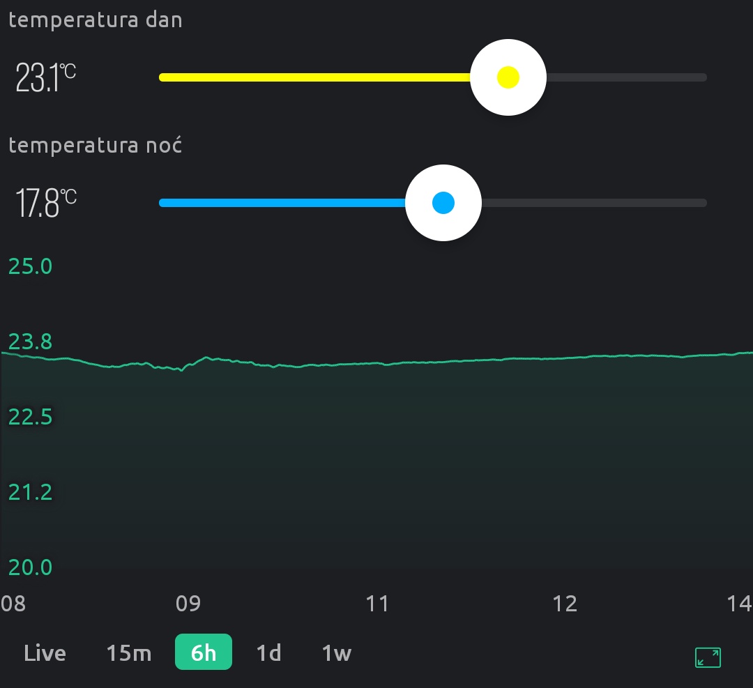
My temperature chart currently has these Y values shown (equidistant!):
20.0, 21.2, 22.5, 23.8, 25.0
For my X axis (hours) I have: 12, 13, 15, 16, 18 (again, equidistant!).
I had hoped that this bug (insane feature?) would be corrected with the release of Blynk 2.0, but apparently not (it’s been like that for the last 5 years).
Can you pretty please make a sane Chart widget, where the positions of tick labels actually matches the values on the label? Tick values should never be calculated by having a predetermined, fixed number of ticks shown, and if that means 1.4563 per tick, so be it (we’ll just round it up to make it more pretty)! Ticks should be selected based on the standard sequence: 1, 2, 5 and never, ever, under any circumstances rounded (so that the 3 shown is actually a hidden 2.5). There should also be a switch on the SuperChart to turn on a grid based on the same ticks.
As it currently stands, the impression is that the SuperChart has been coded by someone who has heard of charts but has not actually seen one in the wild or understands what is the point of them other than to look like a wiggly line with some random numbers written at the edge 
On my own behalf, I want to add that the SuperChart function is really of little use for data analytics. Yes, this is a beautiful widget.
But when you need to analyze processes in detail,
happened a few days ago, it’s unrealistic.
I mean that for the analysis you need to take a short period of time, for example 15 minutes, and see all the processes with high accuracy.
In Blynk, this only works with processes that have happened in the last couple of hours. That is, it is impossible to take any period of time (for example, 10 days ago) and consider it in detail.
This means that the function of graphs cannot be taken seriously from a data analytics point of view.
Hello,
Please can you make screenshots?
Sure I can but I don’t see why would you need it. It’s not like this is a behavior specific to my device. It’s very obvious how the tick labels were programmed and it’s frankly so insanely, criminally lazy that I believe it’s the first time it’s been done this way in the history of chart plotting. Do a Google image search for “chart plot” and see if you can find any instance where tick mark increments are in some completely random floating point numbers and where those numbers are then rounded in such a way that the label position no longer even approximately corresponds with it’s actual value shown.
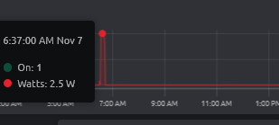
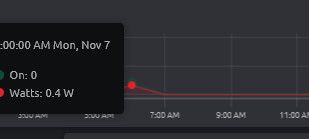
Don’t know if you are talking about that :
selected day scale : 2.5W ON=1
selected week scale : 0.4W ON=0 
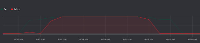
I think that’s to do with the time periods that the data is averaged over, 1 minute versus 1 hour for the two time periods.
But, I think it also depends on whether you have Raw data turned on in the datastream (and if the subscription allows it).
Pete.
I have raw data turned
I also think it is related to the period, in my case 15mn ON.
@dsvilko has started a new topic about issues with the SuperChart widget, and X/Y axis labels is addressed in that topic too, so I’m going to close this topic to avoid duplicated/overlapping conversation threads.
The new topic is here…
Pete.