You can see each datastream is using their own quarter of the y axis but as you pointed out it’s “not right”.
Now we are on the same track 
Ya, ya… everyone is a critic ![]()
I switched from my random generation between 0-255 to flipping between 0 & 1… totally messes with the colour scheme ![]() but the graph still looks normal.
but the graph still looks normal.

Ok I think I found the problem. @Cejfi do you have CONNECT MISSING DATA POINTS set to OFF? I like OFF but changing to ON the Chart looks OK.
Can not be that, I have it connecting all the time. Try to disable it and see if it returns to bugged state?
See my screenshot above.
I mean try it to reproduce it again…
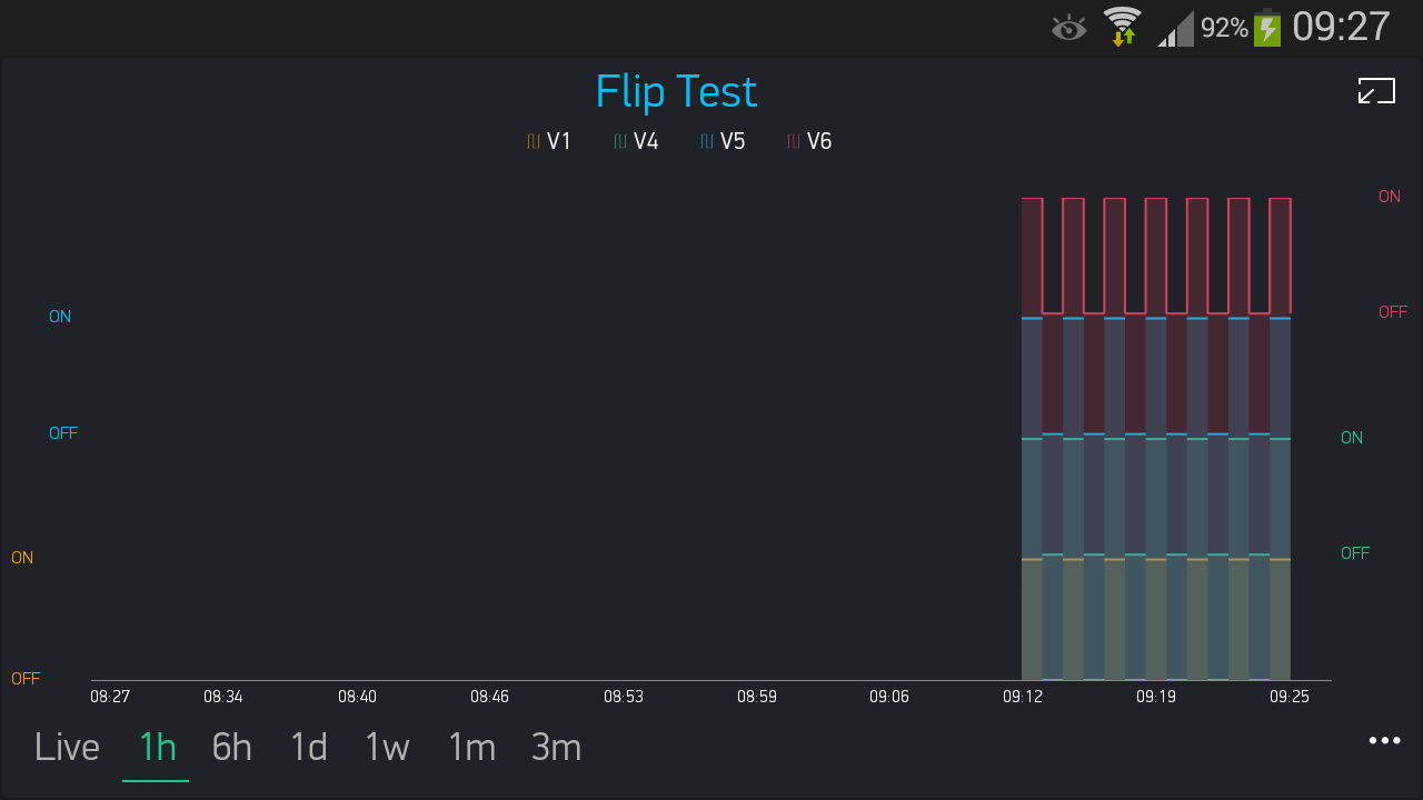
I didn’t understand do you think this graph is now ok? As this doesn’t look ok to me.
@Costas Yes, you are correct… Something definitely messes up when you don’t connect the data points… I had to switch to my phone for this first screenshot as the emulator display (2nd image) was even worse.
Sorry it’s the best I could do ![]()
Not connecting missing data might be another issue but that is not the one I am speaking about.
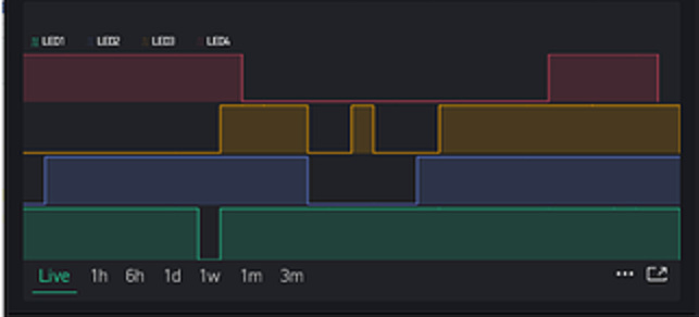
Look again at my first “faulty” screenshot… the shadows bleed down across the whole graph
Good luck with your testing.
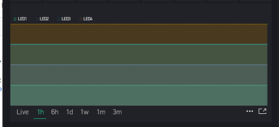
What does this look like in 1h format?
@Costas @Cejfi Strange… once I switched from NOT connecting data points, back TO connecting data points… all my graphs are still messed up, and not just the shadow drops… actual data displays are all wonky… even after removing and reloading/setting up the SuperChart again… Sounds like it did something on the server?
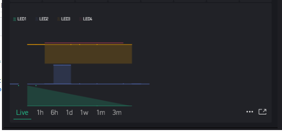
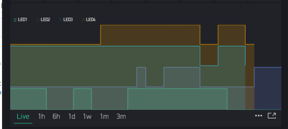
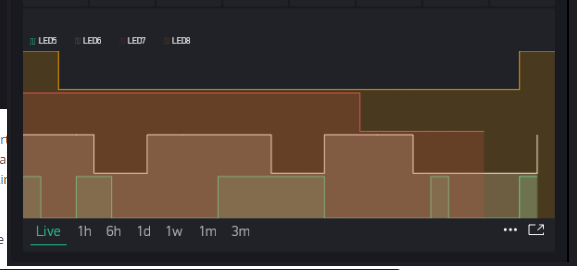
Live:
All other modes:
EDIT - this result is due to incorrect historic data format for this test… but the shadowing, causing muted colours is still valid.
I am rebooting my Local Server to check that theory.
Khm:
Nope, rebooting the server didn’t help. Well @Dmitriy @BlynkAndroidDev it appears there is something a bit off when switching between connected and not connected data points. Thankfully I didn’t mess with my solar chart, so it is still looking nice
PS @Cejfi, my past observations (about your code being a possibility) still stand valid as part of the troubleshooting and diagnostic stage… but bringing them up to make a non-constructive point against the person helping you might not endear further assistances 
1 Like
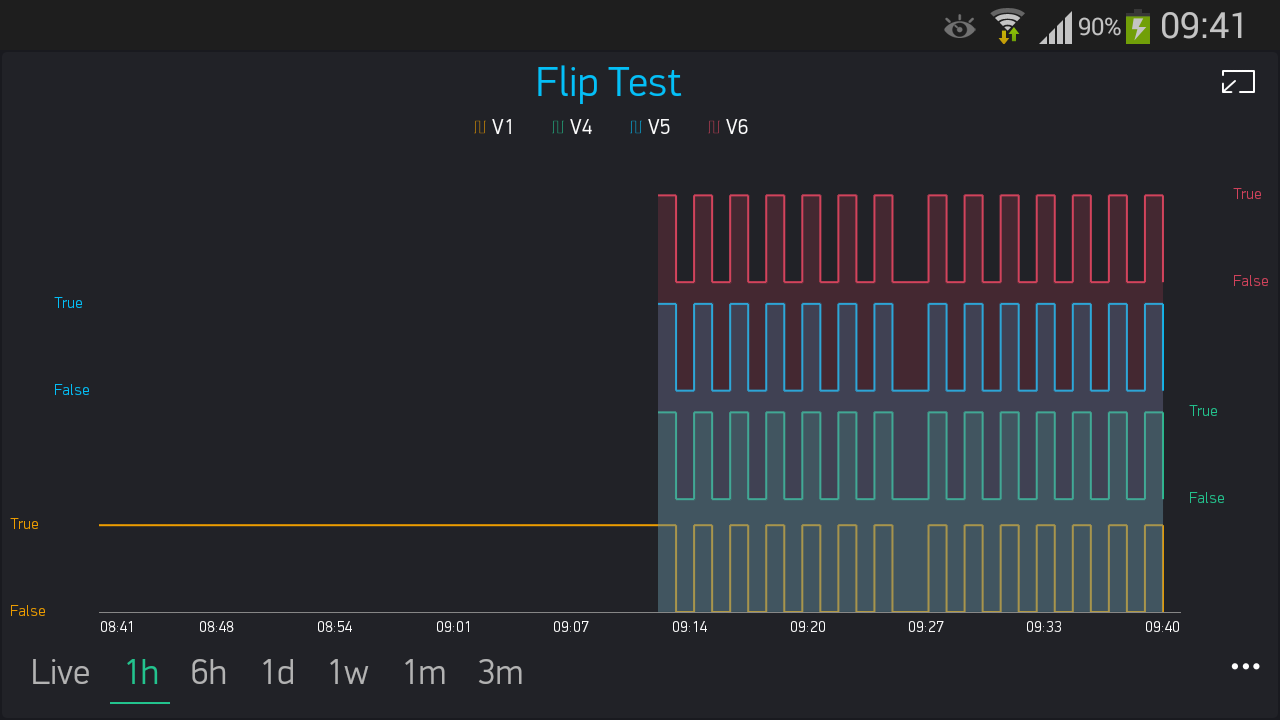
@Gunner I think your 1h is messed up because it relates to “bad data” i.e. 0 to 255. Whereas live data is exactly that and works with the 0 and 1. I suspect if you use new data pins at 0 and 1 it will be fine at 1h+
My chart looks OK in full screen with a full 1h, even with the shadow effect.
Yes, you are correct on that … my mistake.
But my other point is that I did have this before switching from Connecting Data to Non-Connecting Data:
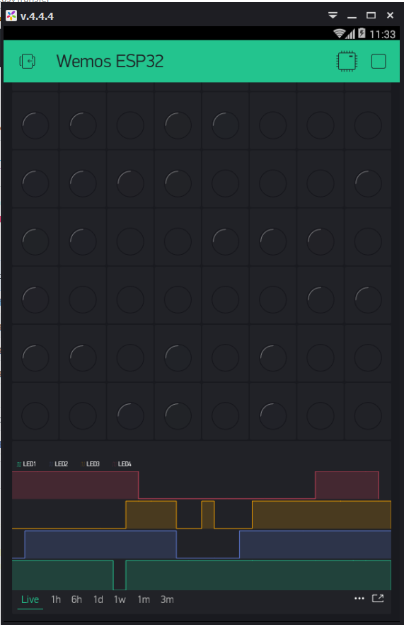
(a blurry crop of an earlier post… since I can’t get back to this anymore ![]()
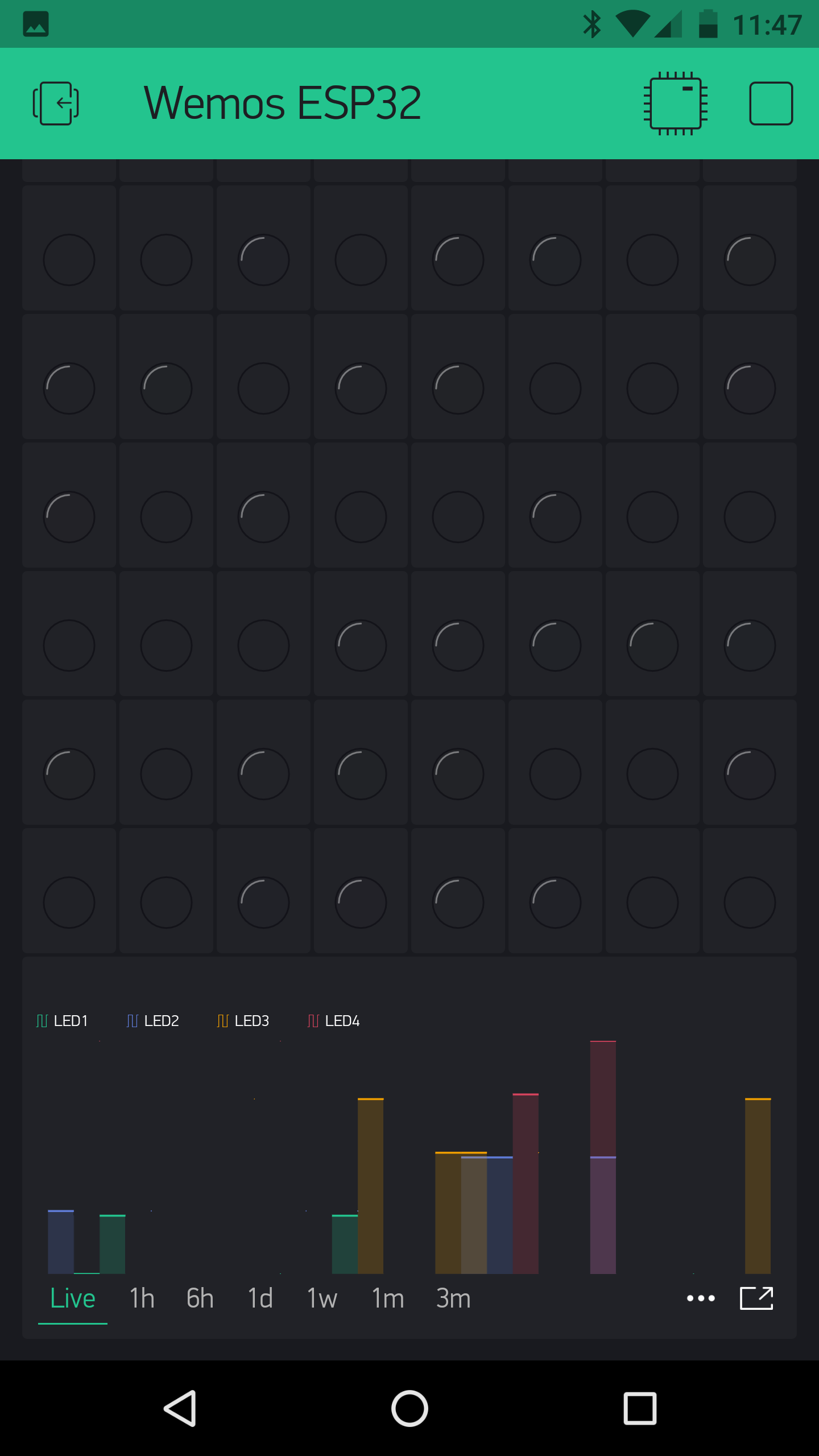
To this after switching back to Connected Data Points… And even after setting up a new chart, new Vpins, on same project and staying with Connected Data point:
 :
:
I would probably have to create a whole new project to duplicate the process again… but I think I have already shown that there is something to what @Cejfi is describing about the shadowing issue at least.