We offer so much flexibility. I understand why you are confused and can’t choose the right layout 
Well I’m not too confused with the layout possibilities although for the given moment I am with some widgets like the Device Tiles (don’t know if it could solve my issue). I’ll go through the workarounds one by one and include a screenshot of some of them implemented so you’ll hopefully see the problem.
make one string on hardware and send to 1 widget (full width)
Since the font is not constant width the values on the right would be shifting left and right around all the time. Not sure who would find this a usable interface?
make 3,2,3, widgets, all with centered labels
This does not help as you can see on the screenshot row 3.
make 2,3,2, widgets, all with centered labels
This does not help either as you can see on the screenshot row 2.
make 4, 4 widgets with centered labels
This will work but even though I know you’re after a more “air” in the layout instead of information density, don’t you think there’s a little bit too much air on the screenshot row 1?
make 2,2,2 with 1 cell offset
This would make no difference as I used 2,2,2,2 previousl and the values did not fit.
Use LCD
I personally find the LCD too geeky in an aesthetic sense. It’s too clunky and has bad contrast with he values (like their real world equivalents of course). It would also be too much work merging values from different sources and trying to make them align on the labels (which would be the first row I assume).
this is planned
If this happens to make 22.5 °C fit in two columns that would certainly help in some of the cases. It also sounds like an improvement besides the cropped values. Good to hear this is on the works!
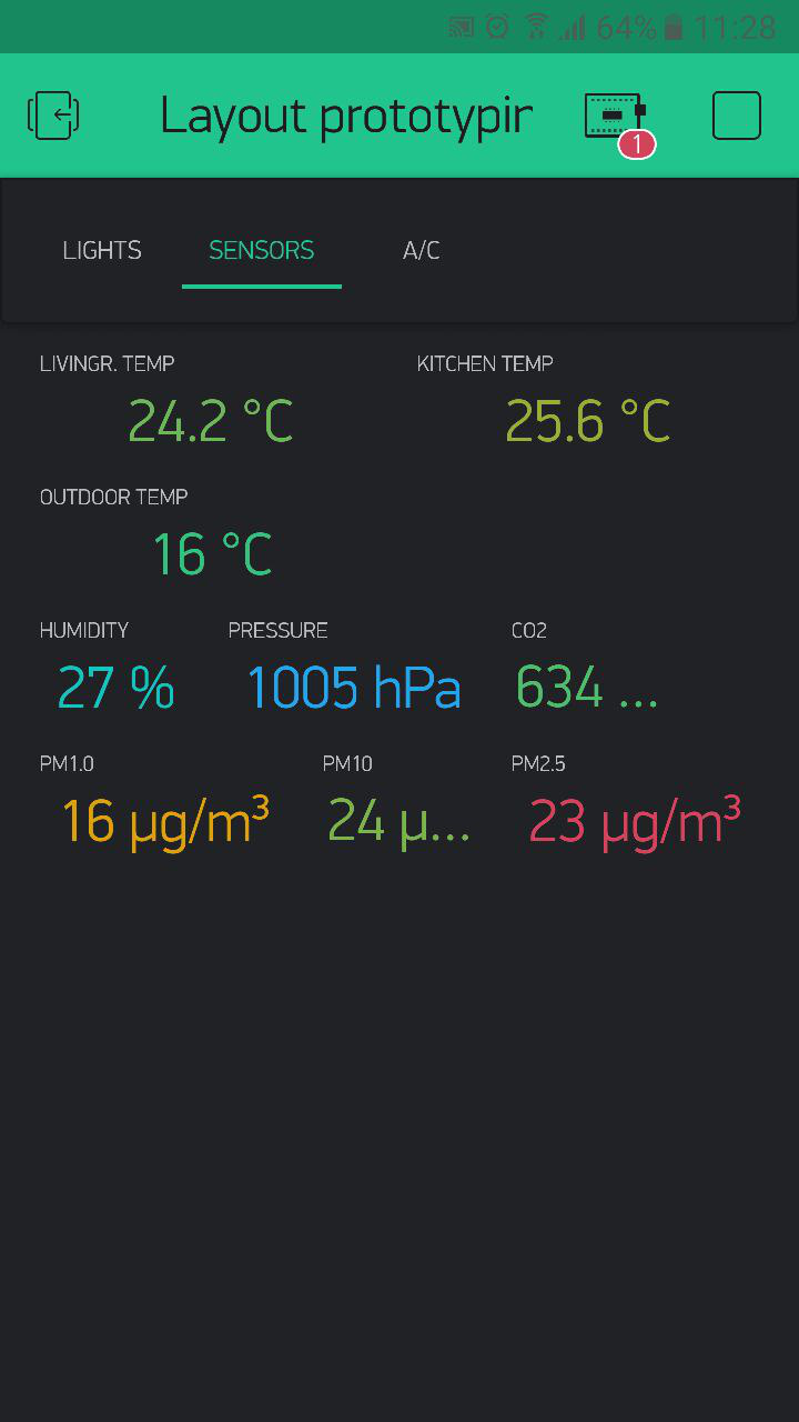
Below is the promised screenshot. All widgets center aligned with medium font size as small was just too small. There’s some obvious issues with this but I’ll still list them:
- temperature values are now legible would be cleaner next to each other since there happens to be three of them
- 2x3x2 with one unused column leaves one value cropped. Of course in this particular case it would make much more sense to make it a 2x3x3 layout and then each of these values would fit.
- 3x2x3 layout of the small particle (PM) concentrations (all related and would be nice to have on a single line) obviously don’t work that well. Please ignore the illogical ordering, it got mixed up while doing the changes.
With a font option between small and medium with the DPI fix to make the values fit an equivalent area of the widget on bigger screens would/will hopefully make things pleasing to the eye again. 
Besides the complaints for this particular design decision/current execution of it I want to say the Blynk team is doing awesome work. The app has inspired me to do so many cool and useful things for me and my family in the form of shared projects. I am thankful for this and also really appreciate you taking the time to personally reply here on the forum.