We had some discussion on your issues and decided to try another small/mid/large test size logic: large selection will make text size at max in the available height, mid - will make text size of 70 percent of the height and small - 50%. We would not scale text size to fit the text in the width bounds, so you will need to resize your widgets in some cases.
OK, I loaded the app into my one Phone and two tablets for a best cross device comparison.
Basing the sizes off the height seems to help a bit… but it can still be reminiscent of “Goldilocks and the Three Bears”… without the “Just right”
Looking at the three sizes, small, med and large across all devices is now more standardised, but can still cause some croping when using a larger font for proper visibility and the value is variable in size.
But I guess what is really irritating me is how the focus seems to be fixing something that was NOT an issue in the first place… and in the process of “consistency”, making it worse aesthetically and for flexibility (adjusting for width is vital for values that constantly change).
All while apparently bypassing the real issue I brought up in my past topic… L K at the fonts in the LABELS and the terminal, across the devices… that is where I was suggesting adding auto scaling… not removing it from where it actually worked near perfectly before.
OK, as a Local Server user, I am just a freeloader here , and I understand there is a commercial background and focus that is driving changes… so I will leave it at this, stop voicing my loud and lonely opinion and watch what the future brings.
At least this has been exciting and hopefully entertaining
then you haven’t been properly reading the above posts. One of the issues is that font sizes are either too big or too small and that list potentially fixes it.
The other much larger issue is the same app used on different devices. Depending on the ppi density you get (in the extreme cases) either really really small fonts OR truncated text. Neither are good options. So some degree of auto-scalability is required to deal with that issue.
@Pavlo: I’ve been following this discussion with great interest and (I think ) I understand the issues you’re running into and the difficult choice(s) you have to make. There’s always the struggle between design over function or function over design. I know I’ve been creating stuff for the last 25+ years and investing, coaching and starting startups for the last 12. The usual mantra (which is the same for your company) is: who is your (paying!!) customer, what pain does (s)he have, how are you addressing that pain and how do you make money off it.
I’m unaware of your long term strategy, the short term strategy ESPECIALLY for software startups is (what the Americans like to call:) ‘eyeballs’ aka users, preferably paying ones. Always keep your long term strategy in the back of your mind, but focus on the short. I’m not quite familiar with your target market, but for now its seems ‘developers in iot’ which makes it an interesting case. Because they usually fancy function over desigh BUT their customers like it the other way round. Anyway your initial target audience appears to be ones who prefer function over design and lets face it: whats a beautiful car which is too small for you to fit in?
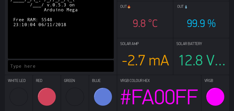
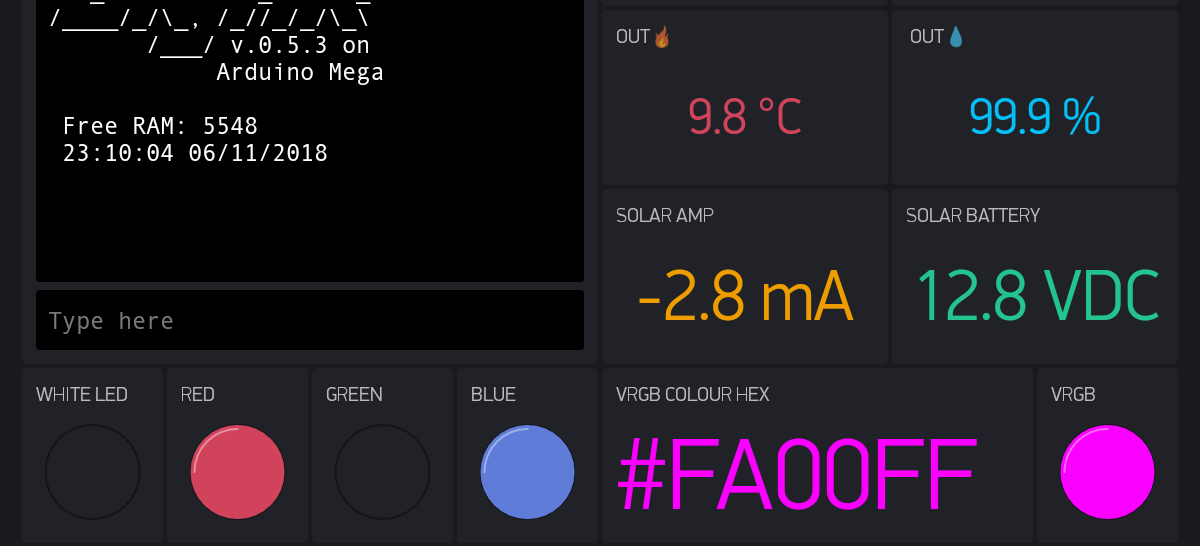
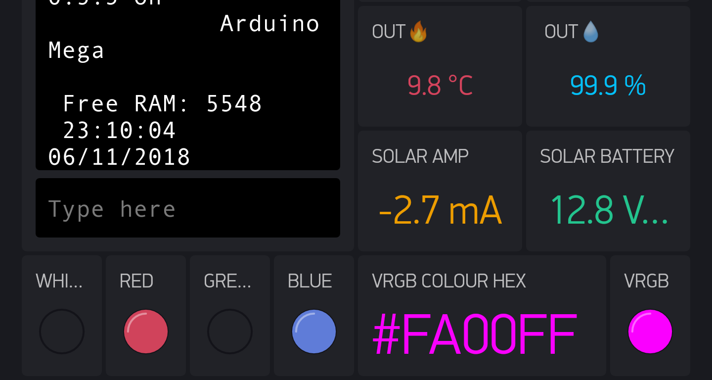
Ok, I’ve tested the test build and taking into account my devices, I tested Blynk on, It seems to be the best available, as it manages to uniformly scale contents of the VALUE and LABELED VALUE widget (Yet some work needs to be done with other widgets - for example forgotten gauge widget, or terminal widget -again on @Gunner’s screen it looks BADLY )
I’ve made a comparison screenshots on three different devices (2560x1440 5,7 smartphone, 800x480 7" tablet, AND a completely inadequate for Blynk 9,7" 1536x2048 tablet), and the “test” build correctly applies scaling. IMHO for some reason better than on @Gunner’s screens.
Still, the potential in previous implementation (where width-dependent autoscaling was applied) was the adaptation to dynamic length strings. I don’t know, perhaps changing the text size property from within the code would help?? Is it already possible @Dmytro?
edit: I did start out with the cloud solution, but as soon as I started to comprehend things I moved to local. So (depending on your cleaning activity) there might still be a project of me in the cloud.
Unfortunately I have to also say I don’t like the new font size behavior at all. On my S6 phone the middle size is too small to fit what it did earlier and the smallest size is too small to be easy on the eyes. And if I set the smallest size it’ll look ridiculously small on my 9.7" Tab S2.
I understand the goal of uniform esthetics but regardless of the target audience it is for sure something to get right. I assume the product for which these changes are targeted creates phone/tablet apps using the same UI as the free/consumer Blynk app. As a developer myself I can’t see how forcing to app creators to choose between uniform look and the focus on information legitibility/usability could be seen as Beneficial. The target audience I could easily see using a Blynk based app would definitely be after for the latter.
I am a big fan of the Blynk app and use it as the main interface for sensors and automation in four locations. Because of this I am a bit worried on the direction where things are going and how often there are breaking changes.
For privacy and latency reasons I am a local server user and because of that I can also be considered only as a freeloader. This frustrates be to some degree as I would be more than happy to pay for the software I’m using on a daily basis, especially if that would mean my I could then voice my opinions from the point of view of a customer instead of a community member. Currently there seems to be no middle ground between buying credits for the widgets and being an app creator. I cannot pay for the widgets but for personal use the business license fees are prohibitively too expensive.
I hope there are plans to fill this void in monetarily supporting the project!
As a separate comment I would like to report that after the latest release I am not able to scroll back on the SuperGraph when using timeframe of more than 2 weeks. Is this an intended change or a bug?
I also believe I had data from a longer period than what is currently shown but about this I am not 100% certain.
I forgot to add a suggestion regarding the uniform font sizes which could possibly make all parties happy. If it would be possible to attach a group of widgets to a (virtual) group, the by width auto sizing could then be applied to each widget in the group. The group could also be all the value displays on a single screen/tab for example.
The variable sized fonts on value displays next to each other have annoyed my sense of esthetics as well. But just not as much as randomly getting the actual information getting cropped if the reading gets higher than most of the time.
There will be a solution to cover various text renderings.
We are also improving the scaling approach as it wasn’t working correctly (not really a bug, but kind of a miss).
A few final notes:
No auto-scaling for single-line labels. Sorry.
Plan the content upfront. It’s a usual practice, especially for limited-real estate. Also, it will add more air to your dashboards and make them more readable and faster scannable by eye
Multi line text widget will be introduced for use-cases, where content length can’t be planned upfront.
We try to make everyone happy, but there are certain extents to what we can do. Hope you will appreciate all the new stuff that’s coming to the platform.
Also, please be open for changes. That’s the only way to make smth better and you know that.
Oh believe me I’m waiting eagerly to download the updated APK as soon as the font size issue is resolved. Thank you all very much for the great enhancements, in particular of the past two months!!
As a separate comment I would like to report that after the latest release I am not able to scroll back on the SuperGraph when using timeframe of more than 2 weeks. Is this an intended change or a bug?
I also believe I had data from a longer period than what is currently shown but about this I am not 100% certain.
You can try to open 1 or 2 month period to check if there are some data after that 2 weeks. Usually if the graph is not scrolling - it is because it had already loaded all available data.
Unfortunately I have to also say I don’t like the new font size behavior at all. On my S6 phone the middle size is too small to fit what it did earlier and the smallest size is too small to be easy on the eyes. And if I set the smallest size it’ll look ridiculously small on my 9.7" Tab S2.
Could you check the test build with another font size approach we are working on now for next build?
Thank you for the replies @Pavlo and sorry for the autocorrect induced typos I only just noticed! Good to hear there are plans on improving the licensing and font issue in some way or another.
I love new features but it’s difficult to take the time in getting familiar with them when the core features you use break apart and take your focus.
One more comment on the fonts and aesthetics then I rest my case. (sorry!)
As an example now after the changes I cannot fit a temperature reading in the format “##.# °C” in the original 2x1 slot size with a legible font size.
I could fix this by making them 3x1 size but then I would not be able to fit more than two on a single row. Or I could make them 4x1 but then they’d look funny as there would be too much air on the sides to make them have reasonable proportions. 3x1 is probably what I would choose but then I’d be left with one difficiot to use column.
To reach a visually pleasing result arranging the widgets is kind of like tetris to me. Empty block does not look good. And having one widget wider than the others when all display the same type of reading where one is not more important than the other would give serious aesthetic eye pain.
I propose two new ways this could be resolved:
Allow changing the grid between 8 and 9 column width on a per tab or at least project basis. I know this would be a huge change and I’m not really expecting this to happen. Although this would probably solve a lot of other layout woes also as not everyone’s display is of the same proportions.
Add a separate field for the value postfix which would then be displayed using a smaller font. The issue I am having, and based on the screenshots so are the others on this thread, is that a postfix makes the content too wide. Aesthetically having the postfix the same size has not been very pleasing to me, especially when it’s something longer than two characters. For instance “ug^m3” which I use for PM2.5/PM10 values.


 lets see how it is when you’ve ironed out the ‘double stream’ bug.
 Thank you all very much for the great enhancements, in particular of the past two months!!