Version 2.16 is now missing x axis labels where previously it was giving too many labels for the 6h plots.
So before 1am to 7am would have a few 2am’s and a few 4am’s for example and now it has 1am to 7am with only 6 x axis labels. This should be 7 x axis labels as 6am is missing, it jumps from 5am to 7am.
Sorry if this is a dupe of an already answered question, but i havn’t been able to find it. Only several unanswered.
Regarding the superchart… the horisontal lines and numbering in “normal mode” are missing. At least people are requesting the function but every time the ansver is: “pres and hold your finger” or use fullscreen mode.
I too miss the function, and i don’t want to hold my finger to read it because this is slower and not very usefull in my oppinion. Neither is turning the phone for a fullscreen view very fast. i didn’t change to superchart because of this.
Should the answers given to people be considered that this is the way it will be, or are you thinking of implementing this as an extra option?
again im sorry if this is a dupe.
Thanks, it will be fixed. We had added strict labels amount for 6 hours and one day periods
1 Like
To the Developers… IF you do add in the scales on the main screen… please make them optional. The way I use the SuperChart is with multiple graphs, and since each scale wouldn’t line up with the corresponding graph, I feel it would just take up real estate and only good for Min/Max readings at a glance… assuming one can read that small ![]() As is, I have trouble interpreting them properly in landscape mode… on a tablet… so while I can’t say it is a bad idea, I do feel it should be optional.
As is, I have trouble interpreting them properly in landscape mode… on a tablet… so while I can’t say it is a bad idea, I do feel it should be optional.
You could use showing graph is some percent part of the graph’s height and then y axis values would be shown only for that part and not for all height.
Not sure I follow… I already have each graph as a percentage of the display… works great! But I don’t see any option for scaling the Y-Axis values to line up?
Besides, my point was that if you make them visible in Portrait, make them optional please… since it is this cramped in Landscape, would hate to see it in Portrait.
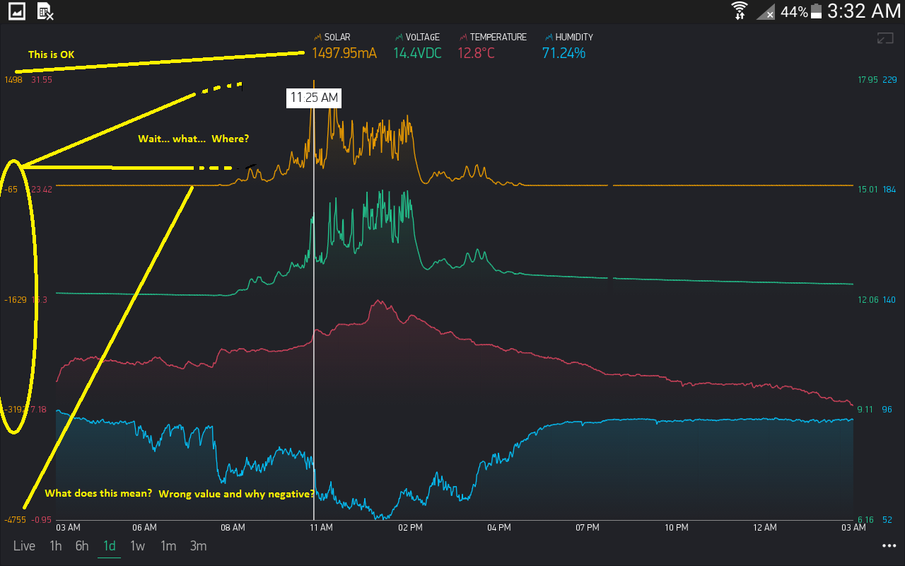
And as an aside… My solar graph as demonstrated is showing a range of -2mA to 1498mA (and shows correctly with the touch)… but the corresponding Y- Axis scale shows -1475 to 1498… so it isn’t even correct in the first place… unless you imagine the decimal point and the rounding etc ![]()
I don’t think we’ll make x/y axises visible in portrait mode. So your streams are setuped for different percent parts of the graph: 0-25, 25-50, 50-75 and 75-100?
Others will cry at this ![]() But my eyes rejoice
But my eyes rejoice ![]()
Yes… and works perfectly as far as displaying squiggly lines goes. I honestly don’t use the x/y scales myself anyhow, but figured I would point out the inconsistencies, while on the subject.
Seems I’ve missed something in our inner discussions, so in a build after nearest bugfix we’ll add support to enable/disable axises in the dashboard.
On your issue with labels - I’ll check it.
1 Like
Confirmed as fixed in the latest version of the app, thanks.