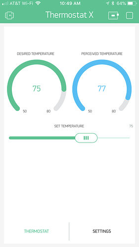
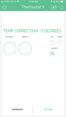
I’m looking for UI layout examples for my Blynk app. I’m using it for monitoring stuff like temperature and humidity in several zones around the house, power consumption, door lock state, etc. Anybody know where I can find ideas on how to organize my app? Or is there perhaps a show-and-tell section?
Screenshots of different UI layouts are literally everywhere in this forum… but why? Do you need interior decorating assistance? ![]()
Just place a widget anywhere, reposition, resize, chose colours, etc. all to your personal preference (within App limitations ![]() ).
).
There are even projects that have QR codes that will load and populate a project… However, the widgets are all customised (pins, settings, etc) for that particular sketch, so will not likely do you any good for your own project… unless you use the same sketch.
For example…
like that ?
@Gunner Thanks for the input. No need for interior decorating assistance.  Just trying to avoid having to “reinvent the wheel”. I find that having an idea of the look and feel of a UI when starting out on a software project, as opposed to just winging it, greatly improves flexibility and function of the end product (e.g. take Bulk Rename Utility - a great tool, but hardly user-friendly). Also, I unfortunately don’t hold the copyright on Good Ideas™.
My question wasn’t meant as needing help placing a label and a couple of buttons. But rather to see how the various setups people have come up with to organize the different bits and pieces of a smarthome.
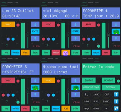
Gotya… well, it can be hard to give a “reality TV” upscale when all the widgets kinda look the same… but @Blynk_Coeur has certainly done his best with creative use of unicode characters over Display Widgets and and Blynk.setProperty() commands ![]()
I recommend you simply start looking through this forum As stated, there are many screenshots of differing layout possibilities of the widgets. Not easy to narrow it down to a specific topic subset though.
I also recommend Googling Blynk under Google Images… once you get past the marketing ones, you will see lots of differing layouts… then clicking through to their respective pages (many right back to this forum) may give you the ideas you are looking for.
I guess it depends what your end use is for the data.
If it’s internal temp/humidity then you’ll probably be more interested in an at-a-glance layout that tells you if it’s within an acceptable limit, so gauge widgets may be more to your liking.
If it’s external data then you may want to include a Superchart to compare the data and see highs and lows.
Once you’ve chosen your preferred widgets then it’s very easy (but often confusing for other users of your project) to move the widgets around.
I find that Tabs are a very useful way of organising data in sensible groups, and I’m growing to like the Tiles widget a lot now (I hated it to start with, but now I’ve revisited it I think I’ll be using it much more in future).
Pete.
thank you Gunner,
but since the last release of blynk.
my UI is ugly.


One of the best UIs built with Blynk so far!
well,
now we are waiting for your basic UI and your code.
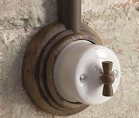
maybe you don’t need Blynk, but just old switches
no code required ![]()
many tks @Gunner ,
this is the best UI
For all the intended humor, our “interior decorating” need is real.
Hackers and engineers are notorious for creating hideous, overwrought interfaces. We tend opt for widget overload, with very little thought given to informational or visual hierarchy, and even less to aesthetics. One of the things that initially drew me to Blynk was that its interface actually looked like a visually coherent consumer product, and it has become even better over time. With the addition of tabs, there really is no excuse for a bad interface, since we can now segregate elegant, usable, everyday interfaces from our tech-heavy, behind-the-curtain, control freak interfaces.
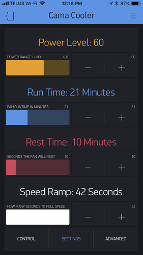
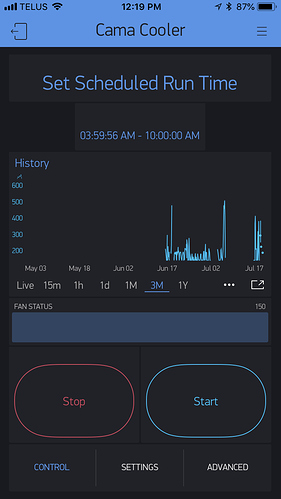
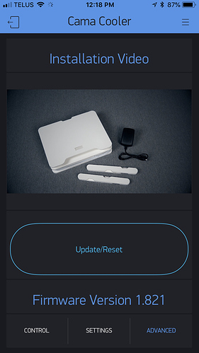
@kotelmach Nice work with the Cama Cooler!
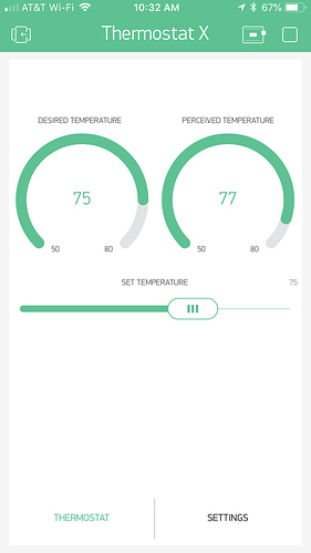
I’ll throw my thermostat dashboard into the mix. Only essential controls are made available on the main tab. Color changing widgets are used instead of stand-alone indicator LEDs. Center justification of the widget names is made possible by adding a few leading spaces. Now, if we could just change that green banner at the top… 
Thank you thank you thank you ![]() for saying that out loud and decluttering your GUIs where possible.
for saying that out loud and decluttering your GUIs where possible.
Blynk will also be shifting slowly towards even more “human”, spacious, accented interfaces with more customization options and ready-to-use beautiful templates. It’s already on our roadmap.
From the very beginning, it was our mission to build a tool that will help talented hardware engineers build nice and user-friendly interfaces with no effort. And still there is so much room for improvement.
P.S. looks like we need a thermostat widget to show set and actual temp.
Sure might be useful but i kindly remind you guys about a simple “improvement” to already existing gauge widget. A “zero” centered gauge. Currently I’m not using anything that needs it, but you can think for example about a simple solar charger: Current can flow both sides: from battery and into it…
You can use 2 level widgets to achieve that.
True…
And while I do like the ability to code unique solutions… for the Developers to disreguard commonly asked refinements seems contrary to that famed “Our mission is to allow developers to build nice-looking IoT apps quickly and with a minimum effort” when you need to hack multiple widgets together (and the required code) when having an adjustable or zero centered option is better UI practice.
OK, and the “zero” centered level widget should be possible too! ![]()
