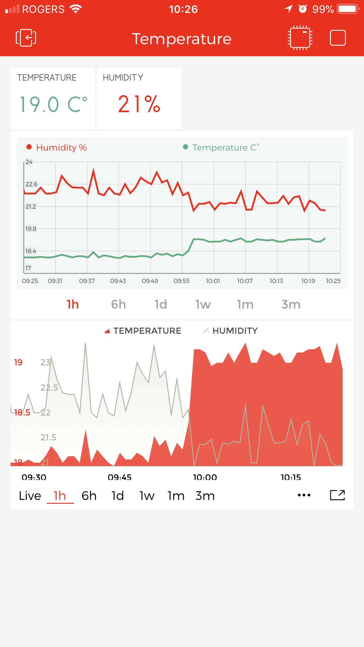
I have an issue with the new charts: all data streams use their own scale so comparing relative values is hard. The old graphs used the same scale and relative changes in data were clearer.
Here’s a screenshot with the old graphs on top and the new ones below. They are showing the exact same data from the exact same source.
In the graph above you can see that as the temperature rises, the humidity drops a bit but not much.
In the new graphs shown at the bottom, since the streams use a different scale, it’s not obvious by how much the humidity drops. Also note that in the second graph the lines seem to cross each other suggesting a bigger change than it actually is.
I just wish the new graphs could be set so that all streams use the same scale.
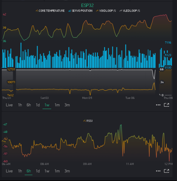
The SuperChart is very customisable, much more than the original. What are the settings for each stream you are viewing? Have you tried setting them for Height, % and splitting the percentages accordingly to ‘split’ the screen horizontally (as in my upper chart shown here)
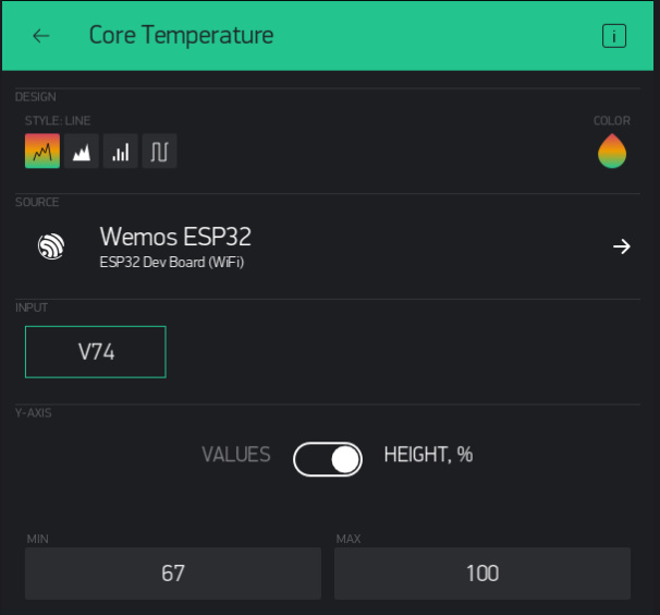
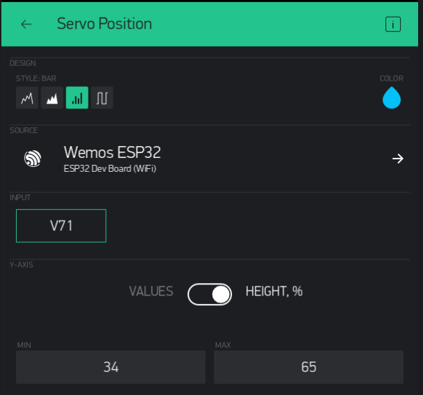
Hi Gunner, thanks for the prompt reply. Unfortunately currently the only way to achieve the same look as before is to fix the y-axis range to pre-set values for both streams (as opposed to having the software detect the max/min it should show).
This makes it impractical in my particular case as winter to summer temperatures vary greatly where I live so if I set a big range then the chart loses precision.
No big deal, it’s just annoying losing the functionality I had in the previous version, but I’ll survive