Well I’ll answer in Russian (to avoid misunderstanding) in vk.com/blynk.
As bonus I’ll describe 3 huge bugs in SuperChart (one of them is inherited from HisoryGraph and rest is new).
And I just repeat once more: no any mess issued from gridlines with Hi-res screens and Tap’n’hold is useless feature (try to use it in crowded metro using single hand, that will be fun). But anyhow both ones are NOT excludes each other, they can co-exist and be turnable off (for example I don’t need tap’n’hold). C u at vk.com/blynk
Wrong thread category.
So don’t.
1 Like
I will second that I will miss the gridlines.
I believe that it make reading the graph much easier when there are gridlines.
Please bring back history graph!
Also… Is there a way to lock the y axis’s of two streams together with smart chart? … In such a way
that it will auto scale? Right now I have two temps and they are set to height %. They auto scale… but they auto scale differently. History graph was able to do this.
Thanks!
2 Likes
Ok… Maybe it didn’t… I just played the scale and it wasn’t keeping one scale… ![]()
my bad!
Yes. In the upcoming updates there will be an option to have one y axis for all streams.
My feedback on the charts :
-
superchart is fine to scroll in the past and check detailed events on a small span.
And is very useful to display data from multiple devices.
Very good widget ! -
the old one is more readable with the gridlines : )
The Y scale labels are not fine on superchart in absolute mode. And as said upper, permits no comparison of 2 streams in % -mode (option should be great but not for the 4 streams, should be selectable).
I finally use the 2 types because they have different. qualities… and keep in mind to always keep one history graph in project to not lose the option 

@Eugene I hope to be checking SuperChart on iOS in the next few days.
@BlynkAndroidDev checked the latest update for SuperChart. The spacings along the x-axis seem to be wrong i.e. not equally spaced across the horizontal axis.
As far as I know it’s always been like.
Take a 6 hour plot in landscape from 08 to 14 with 7 x-axis labels. Distance from 08 to 09 is considerably shorter than say 12 to 13.
Same appears to apply for all plots, not just 6 hours and the same in portrait but less noticeable.
You appear to have squashed the older times towards the left into a smaller space than it requires.
It doesn’t give any confidence that the actual data for any of the plots is in the correct time frame.
First and last labels on the x-axis are aligned left and right respectively, so they would not be cropped. All other labels should be drawn correct, I usually check it via tap’n’hold and it shows that their value is in the middle of their position.
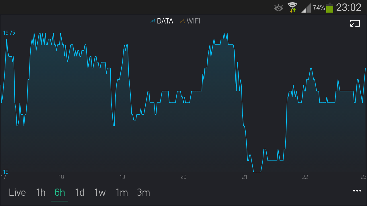
@BlynkAndroidDev screenshot above is the latest version of SuperChart.
It’s a little misleading because the 1 in 17, 18 and 19 takes up less space than a 2 in 20, 21, 22 and 23.
If you blow the image up to full size and measure the distance between each x-axis label you will see that they vary. On my screen 17 to 18 is approx 45mm but 18 to 19 is approx 48mm etc.
Now if that graph only had grid lines… 
1 Like
I agree with some that History Graph was a better graph. Unfortunately I deleted almost all of them and replaced them with the SuperChart, and since then I have had problems reading the graphs. The History Graph was much better to read because of the grid lines and labels on the x-axis. Tap-and-hold is not as user friendly as to just take a look at the graph, no matter what research says.
One other major problem is the difference in the scale if you have two or more datasets and choose scale to height %. A combination between no labels and different scales on the same axis is a disaster. I see now that you plan to fix that, and have one y-axis for all streams, that’s good.
Then there is the ‘Live’ option. I missed that in History Graph, but 30(?) seconds are usually not enough too see a development over time. Instead you should have implemented live update on all the time sets, like in Thingspeak, which I used before i started to use Blynk. Then you could set up a screen as a display which is always on and show development over hours for what you are measuring. Today that is impossible because you have to switch between time sets to update the graph.
One thing that is better in the SuperChart is the binary style graph, perfect for on/off states. So not everything is worse, and with the scale to height% fixed you are on the right track to make a better graph.
Could you elaborate on that? What is limited to 30sec?
The live mode, it fill a screen in about 30 seconds.
Watching a graph with 30 seconds of data normally doesn’t give much information.
Auto-update of the graph with 1 hour of data or more would be great, and I hope you will implement that in blynk some day.
Ребята, верните History graph! Pleeease!
Или хотя бы запилите сетку в SuperChart.
Guys, return History graph! Pleeease!
Or at least make a grid in SuperChart.
I generally like the SuperChart - but like many would like the grid lines back as an option - particularly zero value on Y axis. I’m currently monitoring temperature that dips avove and below 0degC - have a zero gridline would be fantastic in this instance (or the option to enable it ;-).
The best feature is the %scale IMO, really useful in this case also to centre the data.
As Maude Flanders once said, “Wont somebody PLEASE think of the Grid Lines?”
thnx
billd
2 Likes
+1 grid lines. Also miss that. especially zero gridline for temperature. But also vertical line for hour or day.
Despite that: Big thanks for the great work
i run superchart almost 3 hr but didnot c any history, any help?
Make sure you correctly send data.
1 Like