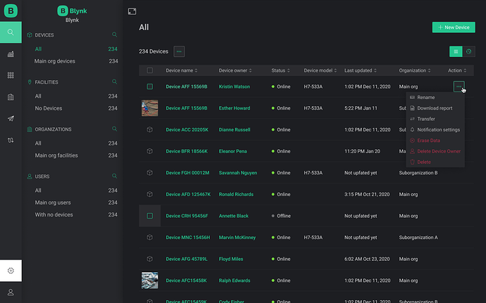
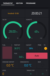
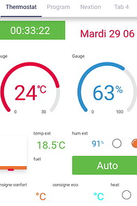
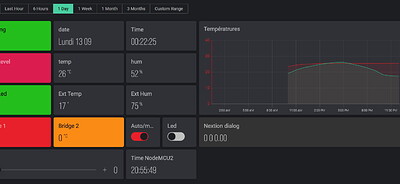
Kindly don’t forget to include dark mode in Blynk 2.0 in future updates. Dark mode is good for eyes.
Work in progress.
Yes, we need a dark mode.
Awesome! Don’t forget the Mobil apps as well.
Nice.
Guys, I really need a dark theme, especially for a mobile apps. Look forward. Thanks.
Artem.
Hi Pavel,
I also want the dark mode background back for the new Blynk 2.0 App. As we all know, a dark background/black provides a much more front-side contrast for many colors. And the “wow” effect is amazing! With a white background, black is the only real color that has the best contrast. Please upgrade soon. Thx.
Dean Sala, Solar tracking control engineer, Blynk 2.0 subscriber
Dark mode please white is too bright
I see the Dark Theme has been launched (Instagram feed) Reading the Creating a Preview Application - Blynk Documentation it mentions legacy-platform…
Q has the legacy platform been upgraded, to me it looks like it but I could be wrong?
BTW The Dashboard is looking great in the Dark Theme
No Blynk.iot update on Play store for me 
Finally, the dark mode is here. 
Thank you blynk team.
No. We just moved the old articles to the new place, as old hosting was on the intercom server that we no longer pay for.
We released just a web interface for now. Apps are still work in progress.
doesnt it cost money to keep a server up and running ?  then again what do you do with your old modems that are outdated…
I am still waiting for the dark background. I may have to cancel my subscription if you do not offer this soon. I can’t proceed without it. You have not provided any updates to the OS blynk (iot New) app at all! And you are at 3 stars 20 reviews as of Dec 5, 2021. I am bleeding money with my subscription. Please update soon.
It should be arriving by this year end. Hold tight !!!
Where did you get that timing information from?
Pete.
I don’t remember on which post. But it was discussed earlier and I remember reading that post by one from the blynk team.
Am I getting confused with any other features? If so i am sorry 


