We are not going to implement widget resizing, however we will add more size options later. Landscape is not planned at all right now, because it will take crazy amount of time to implement.
LCD widget is planned, you can even try it on Android phone, if you have one.
I’m running in on android, and the lcd widget is fullscreen (left to right), so no room for any leds or buttons obviously associated with it. And as I stated it’s massive as just a text-field - I’m not really looking to virtualize a LCD, I’m looking to have the UI of a racing system be able to display [car1name] [car1 time] cleanly and dynamically. Smaller widgets will open up a lot of options, as currently it’s impossible for me to make a useable remote for my project, just based on sizing. I basically am looking for a dynamic display, with a bunch of integrated buttons for a judge to be able to hit to issue flags/penalties on the fly, or overrule timings and win/loss after the fact.
As other people have suggested, multiple tabs would be very useful as well, so I can go from displaying X metrics to displaying Y metrics, or into an input mode, etc.
As for an image, especially once we have smaller widgets, yes I’d like to be able to group them, box them, put colors behind them if necessary, have 1 label covering a bunch of them, etc. Yes, I’d be fine to do it in MSPAINT and just use the img file as a underlay lol.
Lastly, a client/master option would be great. I’d like to be able to have someone log-in (using guest credentials, if necessary) and be able to run the app, but not modify anything.
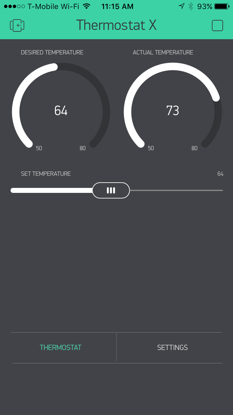
That’s exactly the reason I was dragged to it too. The overall look is just perfect, it looks like a lot of effort has been put into this app. Blynk is perfect!!!
+1
End result dashboard should be as clean as possible and focus on delivery of visual understanding of data. Widget titles should be optional to free up real estate as desired.
Color should be customizable and colors for value ranges per widget (alerts) could be added to make a real impact. If my garden is too dry I need the moisture % in red, if it’s too wet, well… I live in Vancouver, But you get the idea. Without color alerting I would be more prone to just using Tableau to query the history of all my devices on a local postgres or mongodb or even particle cloud if it’s reasonably priced. I will be logging hostory for all my IoT data anyway, but Blynk is a fantastic for real-time device feeds.
Of this whole thread the only design change I agree with is making the background the same as the widget so as to give the “finished” panel a uniform and “cohesive” look. I think the existing graphics are very attractive, even though from a theoretical point of view, perhaps they may not please a “designers” idea of perfect. I don’t like the statement that one design is “better” than another, when in reality it is truly just “different” from the other. It’s a very subjective topic.
Pavel, I think you have done an amazing job of designing a product that is both visually pleasing and functional. You will never to be able to please everyone, although I applaud you attempts to do so.
I also think that new ideas are very important to the on-going development of products such as this, however, the ideas should be presented, not argued.
I’m reviving an old thread. First, I love the evolution of the Blynk dashboard graphics. The widgets all look more consistent, and the removal of pin numbers in running mode really cleans up the interface. I was just wondering if there were any plans to homogenize the background color, and remove the dot grid when the dashboard is in running mode. Seems like it would give the dashboard a more finished look
@Pavlo After upgrading to the latest app and server code, my project’s dashboards are now an ugly white with grid pattern. Is there a way to go back to the black? I looked at the config files but didn’t see anything for the dashboard color in there.