As a designer, maybe I’m the only one bothered by this, but it’s nearly impossible to create a good looking dashboard. It’s really surprising, because the Blynk app itself is BEAUTIFUL. The hand of a graphic designer is evident. The interface, UX and widgets are elegant and modern. But the resulting dashboards… yuck.
A few changes that could improve the dashboards:
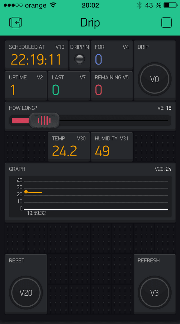
1) Lose the dot grid. It’s helpful when placing widgets, but is unnecessary when the finished dashboard is running.
2) Same thing for the pin numbers on the widgets. That pin number is important for defining the widget, but just adds noise to a button or numerical readout that you’ve already given a more descriptive name.
3) Use the same color for both the dashboard background and the widget background, so that there is a seamless integration of the two.
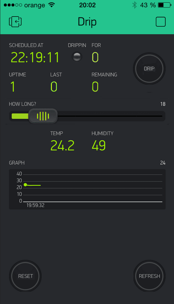
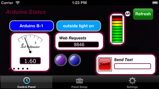
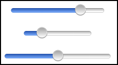
I borrowed another user’s very heavily populated interface (13 widgets!!!), as a before / after example:
This is sort of an extreme example. Even the cleaned up version is still pretty busy, but the unnecessary information has been removed, and the information is presented as a cohesive group, rather than 13 separate interfaces.
One additional thing could really improve the design: resizable widgets. User interfaces typically use a hierarchy of sizes, so that important information is presented at larger scale than secondary and tertiary information.
Well done, @chrome1000. I really like your before/ after images! (except for one color for everything) . Thanks for pointing things out.
Merging dashboard background is planned, we just have other priorities now.
This is arguable since it was added based on our experience with prototyping a lot. However I agree, that at least it can be optional whether to put Pin numbers or not. Especially when we add dashboard sharing. Your family members should not care about pins, for sure.
In terms of design widgets, I also plan to add Text Label Widget, Image Widget (i.e add your logo). Some people here expressed their ideas on adding Tabs Widget. One of the ideas from the very beginning of Blynk is to add icons for Buttons and some other widgets.
If you have any thoughts on design, you are very welcome!
I agree. I know Blynk is still starting out but for it to catch on or be used in products or commercially it will need a more elegant/customizable dashboard. All in due time I am sure. Keep up the great work!
There’s a graphical inconsistency in the widgets. Some of the widgets (e.g. button, gauge, value) have a clean, modern 2D aesthetic. Others (LED, slider) are faux 3D representations of real world hardware. If we want to create a beautiful dashboard, our widgets should speak the same aesthetic language. My personal preference would be for the more abstract style that is currently used for button and gauge widgets. Maybe alternative widget styles would make sense as plug-ins, or as an in-app purchase. Steam punk widgets for 99 cents, anyone?
A change that could make the dashboard truly universal would be to allow for a graphical underlay. Allow the user to create a background image, and then sprinkle Blynk widgets, on top of it. Ideally, the widgets would have transparent backgrounds. In that way, dashboards could contain as little or as much information as the user desires, using whatever fonts and graphics are desired. Want your company logo on the dashboard? Put it in the underlay image. Want to use icons instead of text? Chinese calligraphy? Drawings or photographs of the objects you’re controlling? Just add them to the underlay image. In this way, the graphic quality is limited only by the skill of the creator.
Great thoughts. Thank you!
More customization can be added, however, it’s not a priority. I personally stand against a lot of customization. Especially backgrounds and fonts.
Yes, freedom invites both good AND bad design, but that’s not the fault of the tool.
Re. the gauge design: actually, that’s one of the widgets that I prefer, because t’s not trying to emulate a needle gauge or VU meter. The widgets that I have a problem with are the LED, which attempts to look like a T-3/4, and the sliders, which attempt to look like physical slide pots. The LED is especially annoying, since it represents a hardware solution. That widget should represent the function of an LED as a binary indicator, and not the the physical object that gets stuffed into a PCB. In fact, “indicator light” might be a better name for the widget.
I also doubt about LED design - and I’m going to change it slightly soon. But for the slider - I believe it should look like a physical slider - otherwise I think, the “design” is lost.
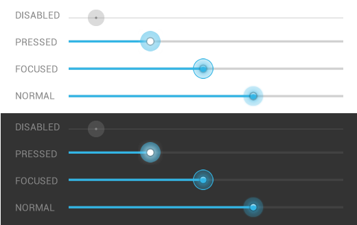
Object should be self-explainable, it should also “invite” for interaction. This is why I hate Android and current iOS sliders. However iOS is a bit better.
Thy are as bad as this control design could be bad: small area to interact, no physical reference…
Previous ones were much better as for me: the handle with inner shadow is “inviting” you to touch it. The bevel is clearly on a “higher level”
Look at Android OS which is very flexible for customizing. And then look at iOS, which is super restricted. I prefer Apple, because, I believe, design should be done by designers.
Also, I agree with you about Apple v. Android. But both of them do a slider that represents the idea of slider, without pretending to be the physical object.
What’s the difference between idea and representation of an idea in this example?
Show me a good slider design, which doesn’t look as a physical slider and still sends the message about how to interact with it? (no Androids and Apples - they suck by default )
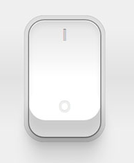
The Blynk button widget represents the idea of a binary switch. It shows the on / off state, and has a point of interaction, which is all it needs to do. It’s an abstraction of a switch, and doesn’t try to represent the physical switch, like this one does:
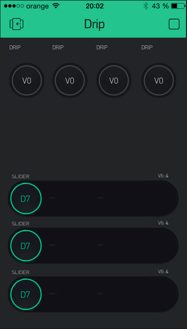
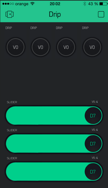
By contrast, the Blynk slider does try to emulate a physical fader, with the slot through the console, and concave head that overlaps the slot.:
If I were to design the slider, I’d probably base it both graphically and conceptually on the button widget.
My point isn’t really that the aesthetic needs to be representational or abstract (although I prefer the more abstract). It’s that whichever aesthetic is chosen, all the widgets should come from that same graphic family, so that they look coherent when used together on an interface.
Pavel, I’m afraid that I may have offended you, which was not at all my intent. I love the Blynk app, and applaud the work that you’ve put into it. I’m just trying to help make Blynk as good as it can be. I hope that you’ll take any and all suggestions in the spirit of friendly collaboration.
To address your points… Yes, the Blynk button widget is a 2 mode device. It can be a momentary switch (which Blynk calls “push”) or a toggle switch. However, the nomenclature “switch,” whether referring to the momentary or toggle variety, is a description of function, whereas “button” describes one form that a switch can take. Both “button” and “switch” are accurate descriptions of the button widget, but for different reasons.
I’ve taken your suggestion, and put them in context. To save time, I haven’t bothered to give them different labels.
No offense at all, it’s a discussion! A constructive one, I hope
I think that your slider designs are:
very bulky as for me
when in zero state - they are very similar to buttons, on a low-quality screen, you won’t even see a difference between dashboard background and empty widget. I believe form should follow function.
they take more vertical space than current slider (if I’m not mistaken)
look really odd, comparing to the majority of thin lines in the rest of design
The only thing I like is the drag area - for mobile it’s really good.
I also never mean to offend you in no way, just searching for better solution
One of the features of Blynk that drew me to it was the graphics. I think they’re clean and modern and efficient. Most importantly, they’re (mostly) consistent. There’s maybe one element I’m not totally crazy about (zeRGBa). Though smart and functional, it’s too big and out of place with the other elements. But I have the choice to use three sliders instead.
I’d like to see more sizes of existing elements like the gauges, graphs and buttons, but I’m loving this app. Looks great & works great…AND doesn’t look like it was designed in Microsoft Paint.
Lastly, I’d just like to say that I think the title of this thread is as offensive as some of the content. Everyone has the right to their own opinion, but it comes off badly when you believe something as subjective as your design-sense is better than anyone else’s. Starting the tread with the title, “BETTER dashboard graphics” sets the tone that the existing graphics suck…when I’m certain most would agree that the opposite is true.
@nickcornaglia The possiblility that something can be made “better” does not mean it sucks. Even great things (like Blynk) can be improved, and critique is an invaluable part of the process.
Another vote here for resizeable widgets. My 5" phone has tons of room to clearly display the content of 6 16x2s, and a bunch of bottons/indicators. I might be able to get that working with Blynk if I were permitted landscape mode, but that’s not available at the moment as I understand it.
And I’d love to have the ability to set the app to fullscreen, and have a graphic underlay (boxes, headers, shading, etc) - basically, a standalone remote control.
 Well done,
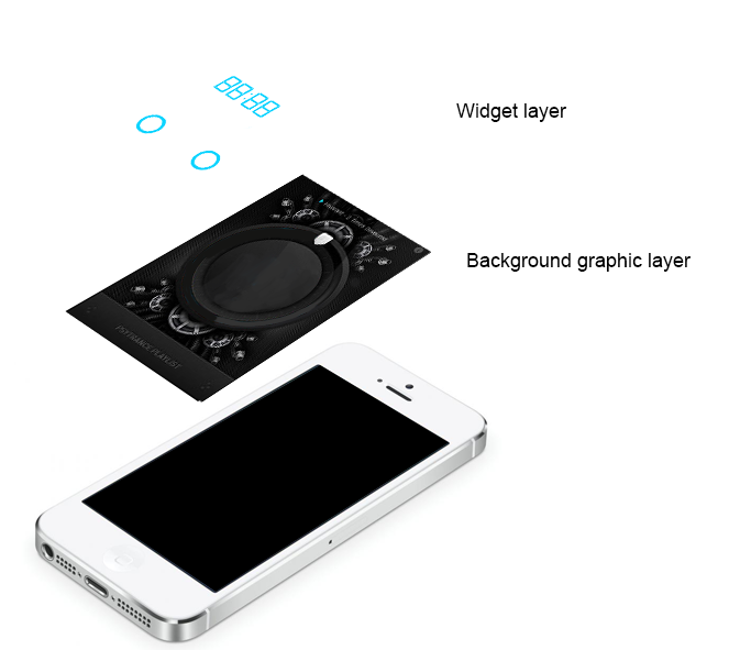


 It seems that you’ll have to stick with another designer’s view for now ))) Hahah


 . zeRGBa was an absolute experiment, we just wanted to do smth crazy