Hello,
i have a minor complaint regarding the efficacy of the super chart as a data visualization tool 
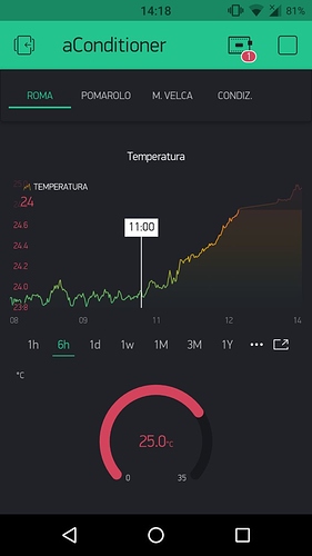
In the current implementation, we have some fixed positions for the time labels and in those position it shows the closest approximation for the time that can be expressed at that level of detail.
That’s all fine in the 1h graph, as that detail is down to the minute.
Moving to the 6, 12 or 24h, we have that the label “9” can correspond to anything between 8:30 and 9:30.
This greatly reduces the accuracy with which one can read the graph “at a glance” (that’s up to 1/6th of the with of the graph shown) without having to dig into it through the tap-n-hold.
The same goes for weekdays in the 1w and 2w graphs.
In my opinion, it would be better here to have the numbers scroll with time.
Also, a great help in quickly reading the graph would be horizontal graph-lines, maybe toggle-able.
I hope you’ll want to take this into account, and thanks 
