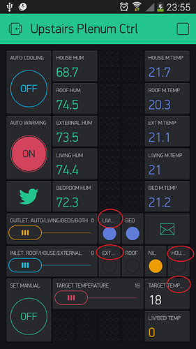
This may be in here already - but text on buttons - in the top left hand corner. Can you relax the restriction on that ?? I can only fill the left side of the button space with text… so that house heat for example ends up as “house h” - yet there would appear to be a fair bit more room available ?
this problem already posted many times, still not attended to by developers ![]()
and not just buttons: Value Display widgets also…
It seems to be limited to 8 characters ? I thought this limitation went out with DOS!!
I just decided to give Blynk a try with my node red installation using the free credit (Thanks) but this is not promising…
Also It looks like my widget is a fixed size can’t see how to make it larger.
@scargill this limit comes from Android devices zoo. 8 char limits fits all devices and making it larger may make it cropped.
@Pavlo what do you think?
Hi, i also think that is a serious limitation…why don’t you create a new resizable label widget? (and… congratulations from a newbie  )
)
Android limitation ! how am I going to have a couple of temperature readings, one for the spare room, one for outside temperature, as a customer this could be a deal breaker.
If I use Thingstudio or UI I can have any label I wish, I realise these are maybe different technologies but if I can’t give my data a suitable label it’s a big issue!
Surely if it overflows - then people will realise that and reduce the length - in my case - a fairly standard HTC ONE M8, the text “ORB AUTO” is the maximum I can put in and that takes about 2/3rds of the available space.Because the characters are variable width, sometimes it takes up less space. For my heat control I have “HT UP and HT DOWN” - an extra 2 characters would make all the difference.
@scargill @Dave1829 good news. This release is special for you (1.10.2).
- We removed all limitations on label length (if we didn’t miss anything).
- Added new larger value display;
Next release will include :
- On/Off text labels for buttons;
- One new widget;
and will be in few days. Stay tuned!
You are wonderful. I needed some good news today as we’ve just had a flood. That’s cheered me up - I’ll look forward to seeing this.
@scargill if you are using Android the new stuff became available a few hours ago on Google Play.
Excellent - got it - works - my two next goals - are the buttons no longer being ON and OFF - and you say a few days - great… and multi-pages per project… any timescale on that last one? Removing that text limitation has made things look MUCH nicer. Thanks.
Our expectation is end of next week.
That is good - I HAVE amended the blog accordingly… the way I see this is one project for here in the UK and one for Spain (as I’ll be using 2 different local servers) - here there is way too much for one page (5 or 6 pages more like it) and multi-pages per project will simplify things for me. I can see one page just full of graphs, another full of RGB controls etc.
Looking forward to the new changes and fixes.
@Dave1829 We have made scaling text on value text for value display/timer/ and two new widgets with the same ui, but for title element I don’t know what could be done, as it has already the minimal text size on android for textviews. This “…” in LEDs are the result of the removal of title’s length limitation (which were 4 symbols for LED), as we don’t want for widget’s titles to crop texts larger than their size
@BlynkAndroidDev I think we need to remove “…” And have an additional character instead of it.
@Dave1829: will it be better, what do you think?
@Pavlo this is already done in case you type 4 chars. But no more… So it depends on length of string. There is no simple solution unfortunately.
But we can just crop without “…”
The ‘rule’ appears to be if you have 4 char it displays 4 char, but if you have >=5char it displays 3 char and ‘…’
Which is funny as the … Takes up more space than an extra character
