Supercharts - great on iOS, not so on Android

Hi Blynk.
My Supercharts on Android look poor relative to the excellent rendering on iOS.

I use both Android and iOS devices with Blynk apps.

  • Android 13 on Google Pixel 6a
  • Android Blynk app v 1.13.1(145)
  • iOS on iPad 16.6.1
  • iOS Blynk app v 3.6.1 (0)
  • Blynk 1.3.2
  • Windows 11

Here are two screen shots of the same Blynk app. Full-screen mode is not much different.

Note

  • vertical axis positioning differences
    red axis gone in Android
    blue axis on RHS on Android, LHS on iOS
  • absent chart labeled “Hot Tub”
    (yes, I measure the temp in my hot tub)
  • You may note other differences outside of the Supercharts.

What more info can I supply? Not sure code would be helpful here.

Thanks in advance.

Excellent iPad image

Not so good Android image

Android app version might be a good start.

Pete.

Thanks!

@BlynkAndroidDev

Most probably thats a bug with color switch to new model with dark/light colors support. Android uaes new fields, iOs (if not the latest version) uses older fields. Please re set colors for streams, i belieeve it should fix the issue, try to set them on Android, if ios does not have darklight color options for datastreams

On the barometer diffeent y axises: What are minmax of the datastream, and whats set up have graph datastream, which scale?

@BlynkAndroidDev looks like he has old-style gradients set as datastream colors. iOS app does not allow setting such gradients any more, but supports the rendering in already configured charts.

Thanks for the quick replies.

On the Weather Superchart

  • Outside Temp and Barometer both set to Auto
  • Colors set to the primary color selections, not gradient scale

On the Hot Tub Superchart

  • Temperature set to Auto
  • Color set to the primary color selections, not gradient scale

Blynk Android app exited and restarted.
Blynk iOS app exited and restarted.

Here are the screenshots. Android rendering still not as lovely as iOS.
Colors appear to be correct. Scaling is not. All scaling set to AUTO.

iOS on LEFT … … … … … … … … . Android on RIGHT

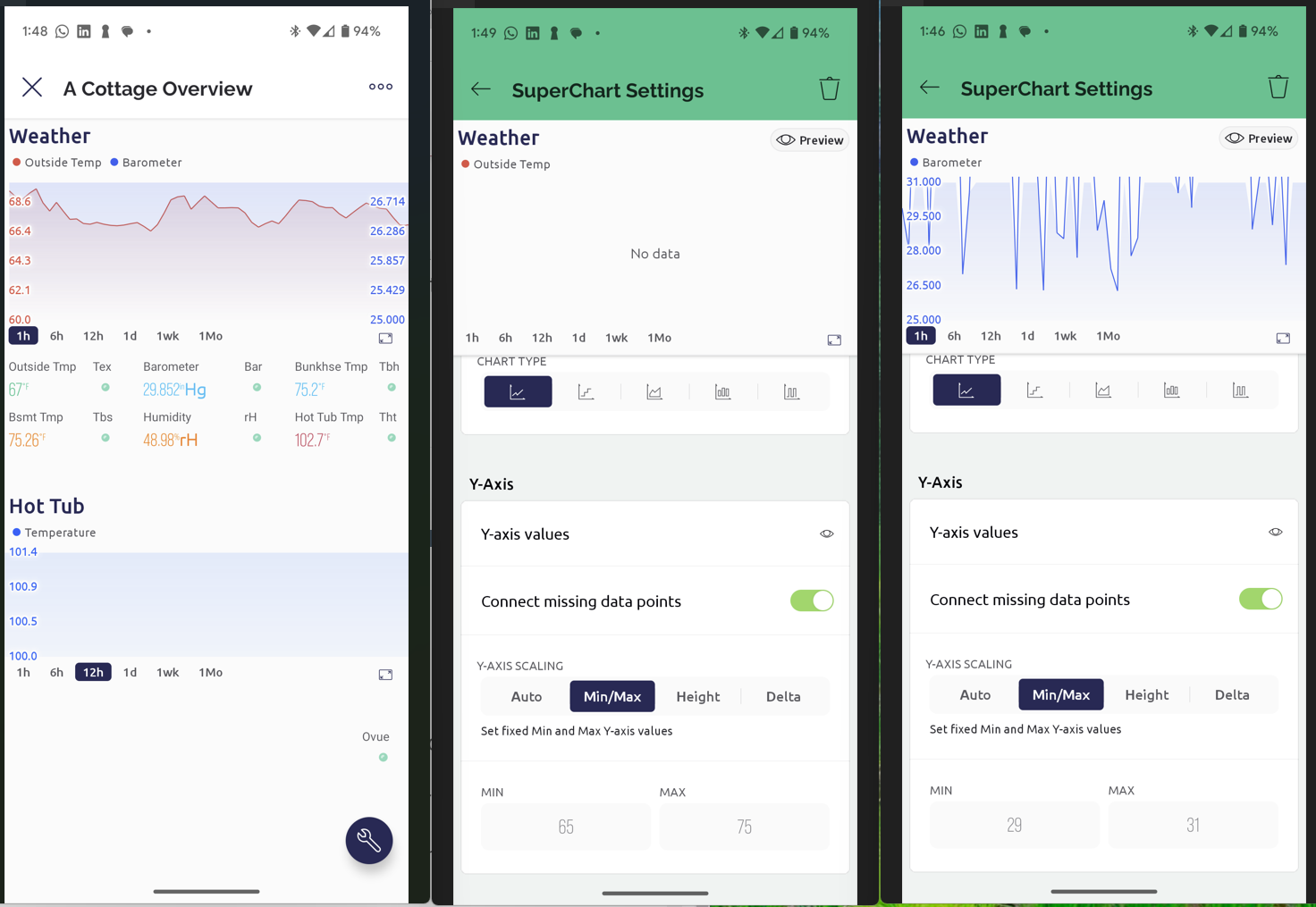
Thanks, android app have missed correct range. Can you provide those streams settings from the app which are shown in the wrong range. Auto scale, what are their datastream min/max?

Thank you again for your time and interest.

On the Weather Superchart only

  • Temperature readings between 65 and 75 recently.

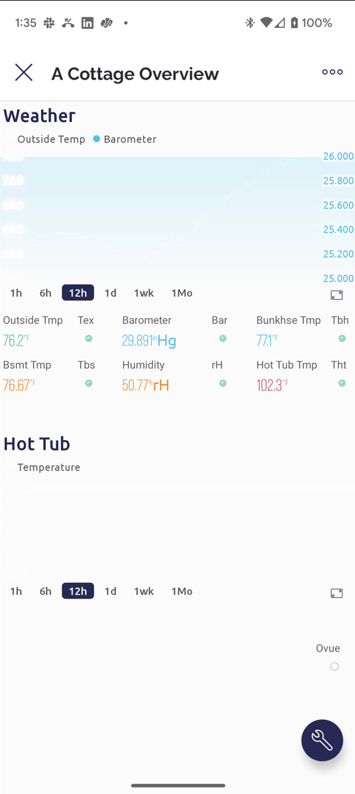
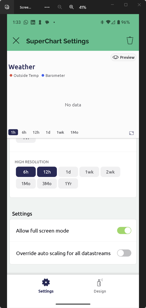
  • Barometer readings between 29 and 31 nearly always.

  • I had not set min or max on these datastreams in the Superchart in earlier screenshots.

  • When I now set Min and Max instead of Auto, the charts still do not render correctly. See below.
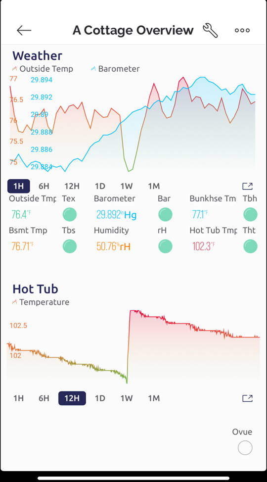
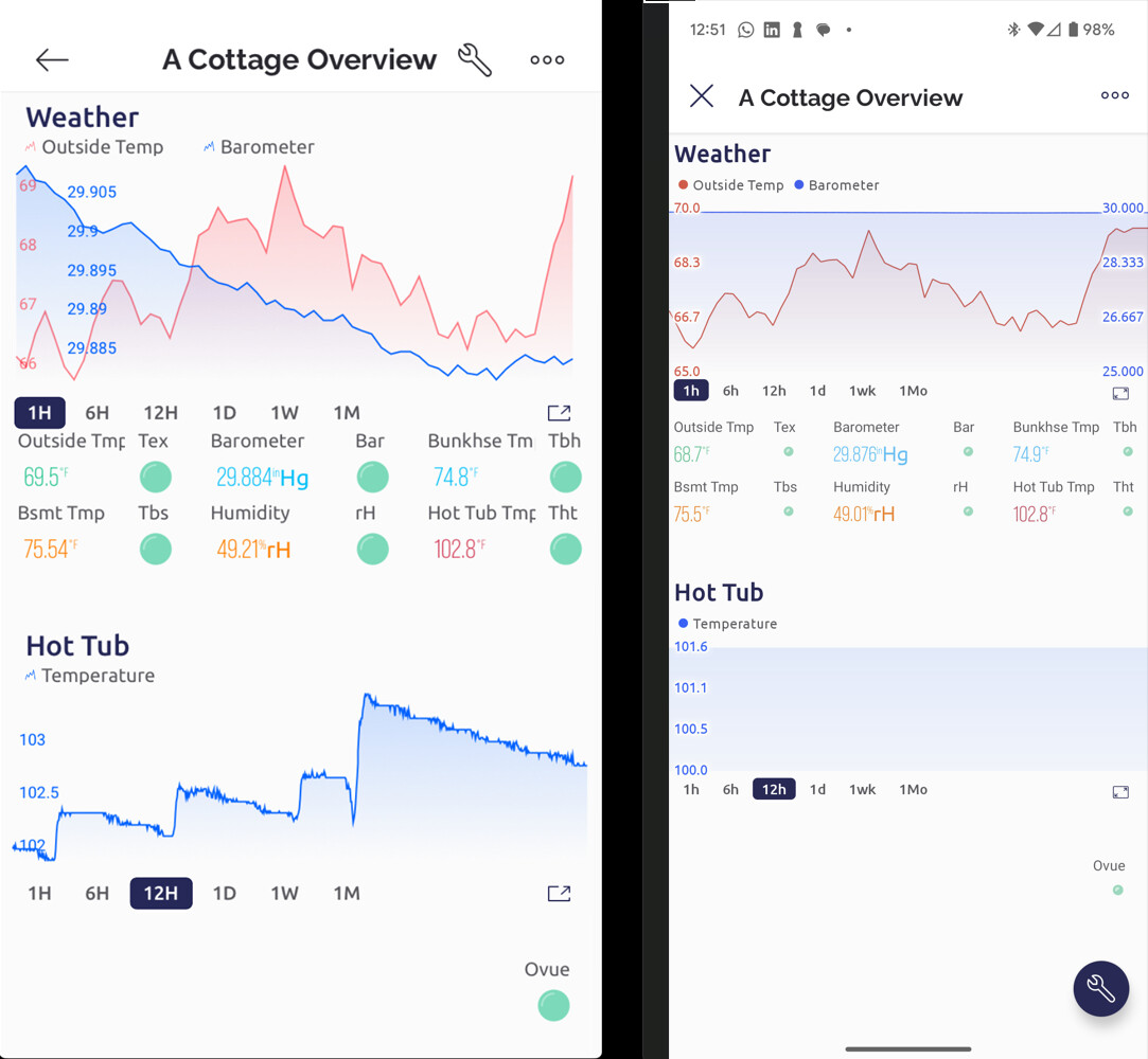
    The red Temperature chart looks good.
    The blue Barometer chart has the wrong range.

FYI only…
Android screenshot
Overrride auto scaling for all datasreams not set

1 Like

But you must have min/max values defined in the datastream setup for the template.

Pete.

Thanks, I will investigate this bug next week, we already planned a minor fixes update 1.13.2, so I suppose this issue to be fixed in 1.13.3

Thanks @PeteKnight And thank you @BlynkAndroidDev for your interest.

In the Weather Superchart

  • the Temperature Datastream limits are set at -40 to 120
  • the Barometer Datastream limits are set at 26 to 42

Much appreciated. The Android Supercharts have never rendered well on Android. It would be nice to have these sparkle. I use both Android and iOS, but the phone I use day in and day out is the Android.

2 Likes

Thank you @BlynkAndroidDev for cleaning up the Android Supercharts.
They work wonderfully now.

Much appreciated.

1 Like