Hello!
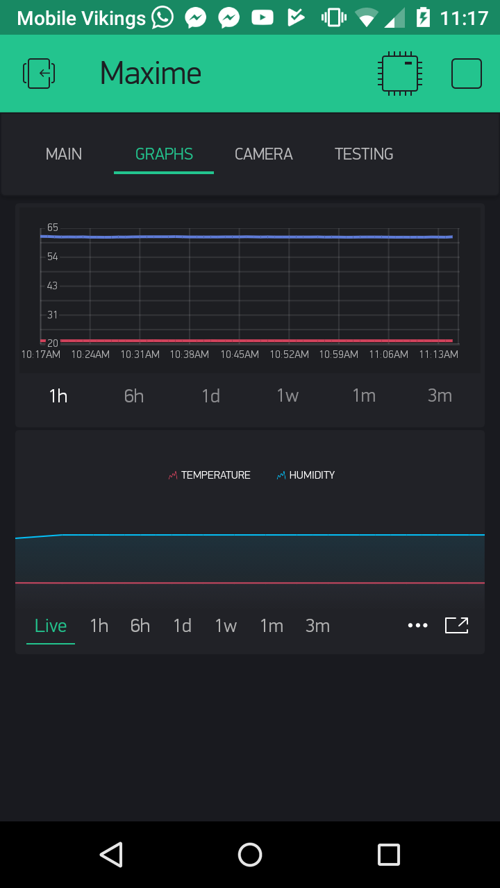
Why can’t I see the Y Axis values in SuperChart when I am not in fullscreen?
Regards
Hello!
Why can’t I see the Y Axis values in SuperChart when I am not in fullscreen?
Regards
Can you see the X Axis values then ?
Yes of course!
I think you might be the only one ?
Because it was designed this way, to minimize the visual noise on a complicated interface. You can always tap and hold to drill into the data. It’s one interaction away from you.
I think that is a big implementation mistake. You could make a settings to enable / disable the y axis
Regards
Thanks for your feedback
I don’t think its a big mistake, but i would like to see that aswell.
Ok I can agree with you, I’ll call it just a mistake ![]()
I would prefer not to engage into UX discussion without knowing your background in this field 
SuperChart is an amazing widget and it beats any mobile charting solution out there, hands down 
I would not call it a mistake at all, he had a good reason why he did not implement it and from all the people who used Superchart we are the only 2 who seem to miss this. Its just a preference. By calling it a mistake you might have offended them if you think of all the time they put in the chart and the app.
That is the reason why I said “I think its a mistake” (I > Subjective) and not “Its a mistake”. Nothing to be offended here. Its and input they might use or not.
Regards
No offense here at all, come on. It’s a free forum, any feedback is very welcome.
The reason for my comments is that I would like to hear arguments, not just a statement. I can offer you at least 5 arguments why it was intentionally designed this way based on the science of human perception, interface engineering and best practices for mobile user experience. While yours “it’s a mistake” - doesn’t sound like a reasonable argument for me, nor it’s offensive, because there is no background 
Is the argument " im to lazy to go to full screen" any good ? 
Lazy solution:
Add a Label Widget or Gauge + color , and grasp the data in a fraction of a sec . You don’t need chart with Y values for that. Don’t use Chart widget for the sake of just putting a chart.
“There is a problem, and there is a right tool to fix it”
- Unknown author
I already have a Label widget, but thats for when i want to check in real time. Im gonna give an argument using my ipad that is fixed to the wall. It is fixed to the wall vertically, so if i want to check the temp 4 hours ago i need to go full screen. But full screen makes my screen go horizontally ( i presume as i think the apple version is not out yet ?). So that means to check the temp 4 hours ago i now have to take the ipad and turn it on its side in stead of just looking at the screen.
By the way im not telling you to change it just for my sake, just giving an argument 
@Pavlo what’s the science behind this:
1 off datastream axis shown on the left
2 off datastreams axis shown on the left and right
3 off datastreams axis shown on the left
4 off datastreams axis shown on the left and right
I can see the odd and even datastreams pattern but I’m interested in the science of visually seeing 3 axis on the left and none on the right.