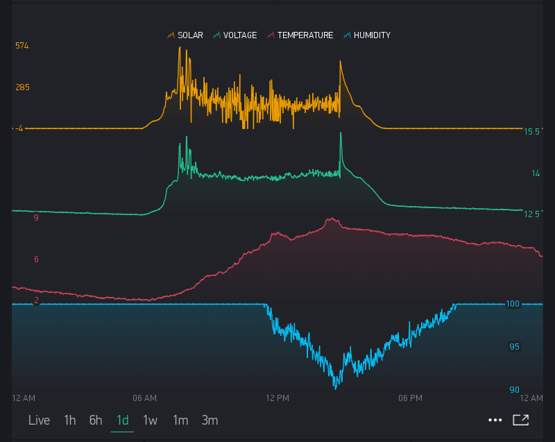
Is the y-axis labeling for each graph in the SuperChart shown below offset to the right relative to the top-most graph by design or is this an error? The graph of the 4 data streams was produced in one SuperChart by specifying the % heights for each stream. I am using the most recent Blynk app on iOS.
Given that the figures have a separation between them, there really is no reason to offset the y-axis for each figure, so they could all line up on the left margin. Alternatively, the y-axis label could be alternated between the left and right margins of the display as well.
Kind regards,
John