Not really an error at least a step back in time. So a new version of Blynk app silently appeared, where one desired change has been noted. BUT…
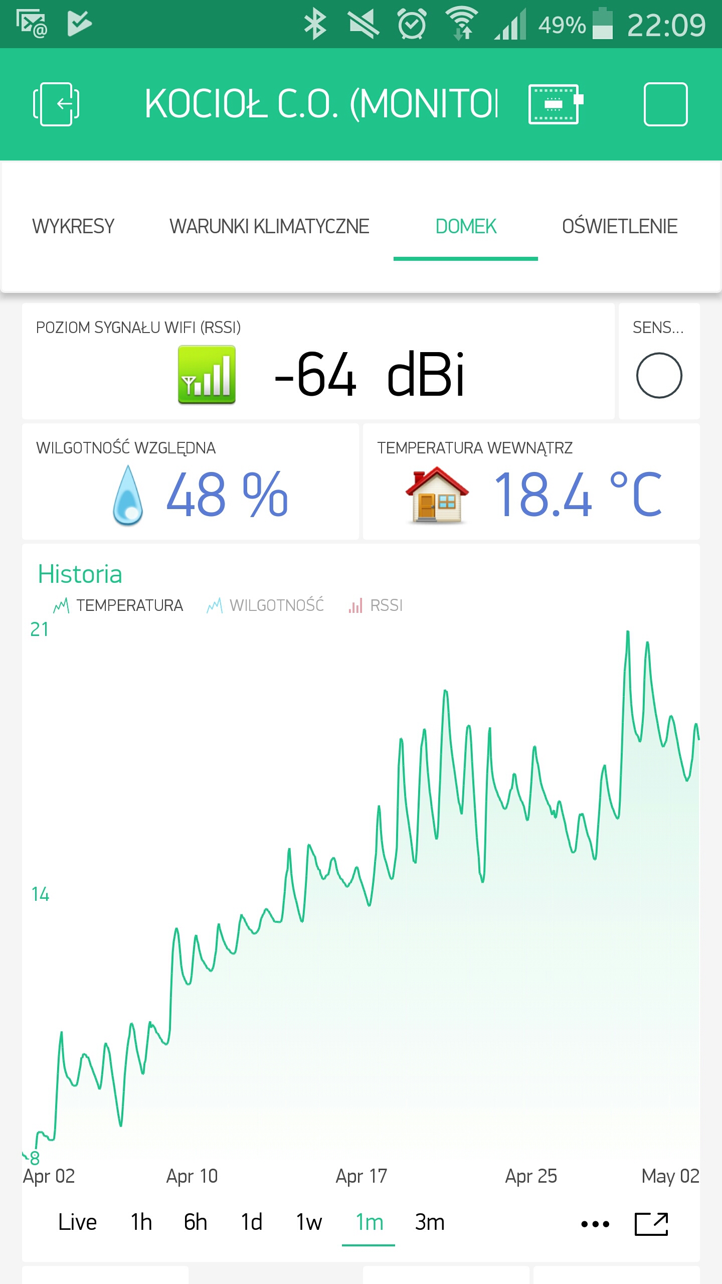
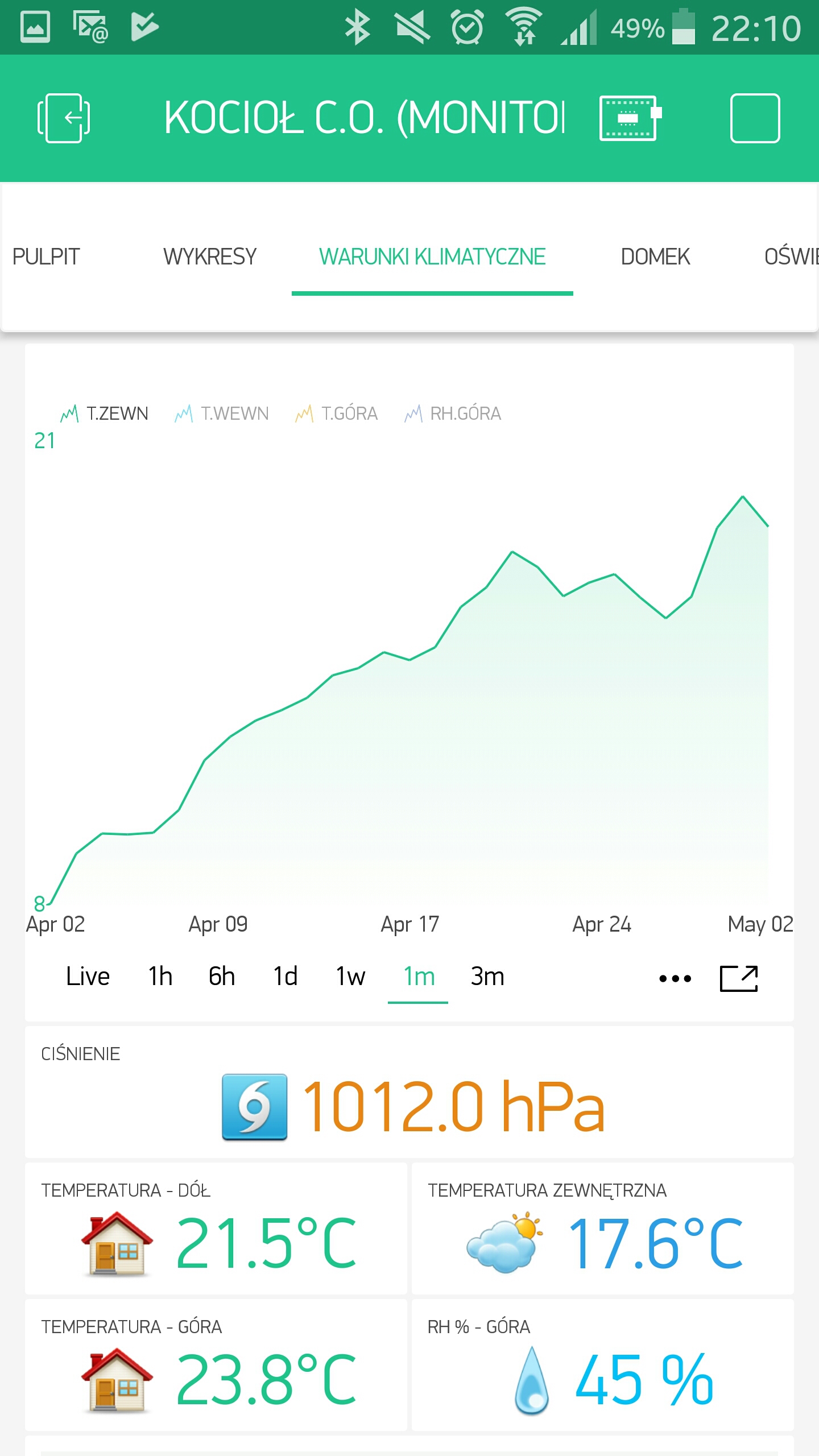
Why the superchart time resolution has been lowered again? Below are two charts of the same variable: the first has an “untouched” widget, the latter after some accepted changes. Well, why is that?
1 Like
There are many reqsons for that. Major drivers are:
- business requirements
- standardized approach. Even majority of financial apps have similar resolution, and we consider them to carry important data.
- consistency with Blynk web dashboard which we are working on
- optimizing data storage on free Blynk Cloud
- performance optimization
- design decision to declutter mobile interface
- consistency with how bar chart should work
There were many other reasons of course
I would have to say that the previous resolution was better. Before I could look at the past month of data and easily see the high and low points.
For example, on the temperature logger I use at my house to monitor indoor and outdoor temps I could easily view the past months data and see what the lowest temperature for that month was. Same for the 3 month period. Now it is kinda useless data.
In previous chart version, data was also averaged. So you just saw a higher resolution of averaging. You still were not be able to get a precise min/max value.
Correct, but it was still a lot closer than it is now. Seems like you would want to move towards having more accuracy than less. I still enjoy BLYNK, and while not really that big a deal, I would have to say the old way was better. I will learn to live with it as this was more a novelty than a necessity (although for some it may be). Ill just have to keep my Time ranges to a week or less.
1 Like
Yeah… I really LOVED the increased resolution. It was low, then at some point became higher, and now is low again. In my opinion TOO LOW, but as we received the voice from the very top of Blynk  … The only way will be to get used to it
  Can’t argue with some of the arguments @Pavlo gave us here, and even IF I could with other ones… Well, I’m on the free version, so…
1 Like
One thing I do expect the developers that should be explained at some point: What are the averaging periods for different time spans? I would like to know at least how to “look” at those charts. Would be nice to find it in docs, but at least a short note here will be enough.
1 Like
LIVE(60, RAW),
FIFTEEN_MINUTES(15, MINUTE),
THIRTY_MINUTES(30, MINUTE),
ONE_HOUR(60, MINUTE),
THREE_HOURS(3 * 60, MINUTE),
SIX_HOURS(6 * 60, MINUTE),
TWELVE_HOURS(12 * 60, MINUTE),

@Deprecated
DAY(24 * 60, MINUTE),
@Deprecated
THREE_DAYS(24 * 3, HOURLY),
@Deprecated
WEEK(24 * 7, HOURLY),
@Deprecated
TWO_WEEKS(24 * 14, HOURLY),
@Deprecated
MONTH(30 * 24, HOURLY),
@Deprecated
THREE_MONTHS(3 * 30 * 24, HOURLY),
@Deprecated
ALL(12 * 30 * 24, HOURLY),

N_DAY(24, HOURLY),
TWO_DAYS(2 * 24, HOURLY),
N_THREE_DAYS(3 * 24, HOURLY),
N_WEEK(7 * 24, HOURLY),
N_TWO_WEEKS(14 * 24, HOURLY),
N_MONTH(30, DAILY),
N_THREE_MONTHS(3 * 30, DAILY),
SIX_MONTHS(6 * 30, DAILY),
ONE_YEAR(12 * 30, DAILY);
@Pavlo I personally think we will never find a granularity that fits all, so we have to add also ability to select granularity for selected scales.
3 Likes
Thanks @Dmytro, that would be a desired feature. While I can “live” with low resolution when it comes to climate variables, I need to think of some other “helpers” to monitor fluctuations of energy parameters for my planning power distribution box. For energy an hour averaging period for a single day is a no go…