Hi!
Firstly, I love what you are doing with the Super Chart. It looks great and has amazing functionality. The issue for me is that the auto scaling on the y-axis can be confusing at times and it forces me to use the static y-axis scaling (the VALUES option).
Auto scaling of the y-axis (the HEIGHT, % option) is critical to many data streams since you do not know the range of your data. I have some specific suggestions that I think could enhance the scaling. Screenshot are from an iPhone 6 SE.
-
HEIGHT, % min and max values:
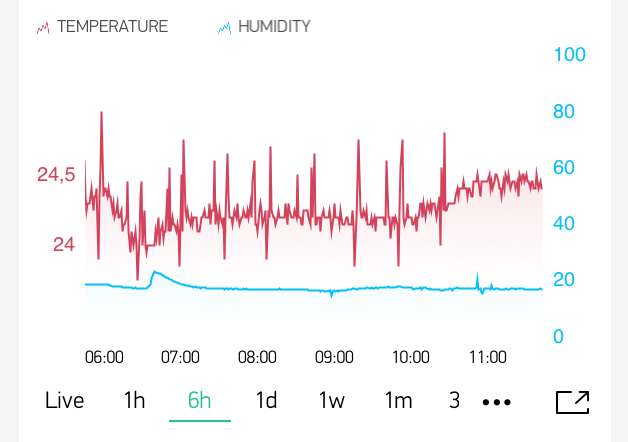
When setting min = 10 and max = 90 I get 10% of ‘air’ underneath and above my graph. This is great. The y-axis values, however, also get squeezed down, so instead of getting more air around my curve, the whole graph and y-axis is just squeezed together. In the screenshot below you can see that the temperature y-axis does not utilise the full vertical space like the (static) humidity y-axis values is doing.
-
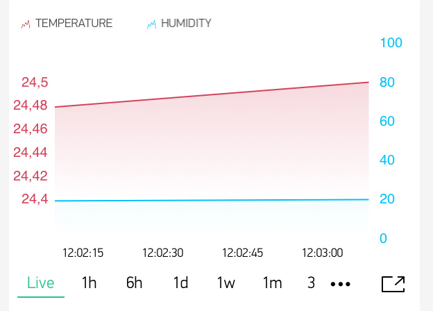
Static minimum y-axis range (maximum zoom)
Depending on your data, there is a limit to how much you want to zoom in on the data. Eg for a temperature sensor where ± 0.3 is just sensor noise you may not want to zoom too much in on it. If you have stable readings around 20 Celsius, you may still want to see a range [20, 30] Celsius on the y-axis or even more. The screenshot below shows the extreme case in ‘live’ scope where time is short and data values are within [24.48, 24,50]. Some ideas to solve:
- Static minimum y-axis range option. User sets a minimum y-axis range (eg. 10, which will stop y-axis zoom at [20, 30] if the middle point of the graph is at 25.
- Pin a y-value to the x-axis and only scale upwards. Typically useful for data that goes from zero and up (for example air pollution PM2.5 values). You pin y=0 to the x-axis and scale so that y=0 and y=max_value is always in sight.