Unfortunately that data gets averaged out (even on Local Server), thus losing true MIN/MAX. My solar graph had spiked 2.5 amp readings showing as less than 0.5 amp in as little as an hour. Basicly made the History Graphing Widget useless except as a broad trend visual (i.e. ohhh… nice wiggly line )
@Gunner my understanding is that as long as the readings are at 1 minute intervals or longer then there shouldn’t be any averaging of data. If you need to read data more frequently you could hold the highest value in each 1 minute period before allocating to a virtual pin for graphing purposes.
I don’t recall my polling rate of the sensors at the time, must have been <1min. I gave up and switched to a simple Graph, but I will give it another try with something around 2-5 minutes I guess.
Ahh, my solar sketch was still polling my DHT11 every minute all along… so I loaded up a History Graph and voila!
About as accurate as my DHT11… which is to say, not very ;)… but better then the averaging I had seen with my Amp readings (which must have been <1min).
Yup… I recall it raining here and there over the last few days
I suspected that was the case but your docs are far from clear on this as they only refer to your server only being able to save 1 data point per minute.
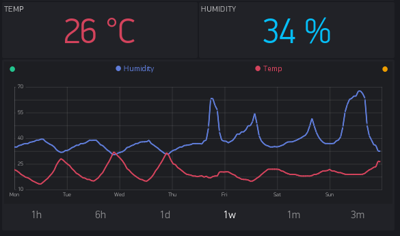
How are you currently handling the 1 hour granularity that covers 1 day to 1 week?
Are you simply taking a plot once every hour or the more accurate average of the 1 minute data points averaged over 60 minutes (as they are on your server in any case)?
More details:
Every data point that comes to the server is stored in 3 fields. 1 minute, 1 hour, 1 day. This is 3 granularities.
Let’s say you sent temp 36 at 01:00:00 and sent 38 at 01:01:00. As output you’ll see:
2 points (36 and 38) on 1h, 6h graph.
1 point (37) at 1d, 1w graph.
1 point (37) at 1m, 3m graph.
Right now we’are improving this. And new graph will have also “live” option with historical, raw data (wihtout any aggregation). But only last 60 points. In case you need only raw data you have to install local server and enable DB storage. As raw data is very expensive in terms of storage, backups, traffic, etc.
Also this limitation has UX reasons. Mobile screens are small so you actually can’t see more than ~100 points on the single graph. So there is no actual reason to return 43200 (30 * 24 * 60) points for 1m graph. You can’t see them all on small screen. Also this 43k of points is 1MB of data. And this will take some time to download, especially on 3g.
I know where the docs are, they are just not very clear :-)[quote=“Dmitriy, post:12, topic:16044”]
1 point (37) at 1d, 1w, 1m graph.
1 point (37) at 3m graph.
[/quote]
Shouldn’t that be?
1 point (37) at 1d, 1w, graph.
1 point (37) at 1m, 3m graph.
Since we plot averages, we can’t know for sure whether it was actual power drop to 120V or an average of 240V and 0V.
But this issue about to be improved with the new Graph when you’ll be able to select aggregation method.
@Eugene just trying to ensure your new Graphing will be as near perfect as possible
The reason I was pushing for a detailed explanation of your current (no pun intended) averaging is that the raw csv data over the 50 minute period shows the “gradual” fall from 240V in minute intervals over 5 minutes, level at 120V for 40 minutes and the “gradual” increase back to 240V over 5 minutes.
This doesn’t imply 0V was recorded from my understanding of your averaging.