Slider widget UI (out of proportion)

Hello,

These are screenshot of the same template, one from IOS other from Android.

!

I created the UI on my ios device, that is by placing the widgets n positioning them.

Later when i wanted to check on the android phone, its looks like the widgets are magnified, it looks too large or out of proportion.

This may be my personal opinion. Others may like it.
But in comparison to IOS widgets, the android’s look kind of bad.

I have turned on show values on ios, but the values are not being displayed.

Even the tile icon is not updated even after choosing an icon.

@Madhukesh yes. The image on the tiles screen is the product image. This icon is used only in the provisioning. We have an internal ticket to fix that.

@BlynkAndroidDev FYI.

1 Like

I don’t like the big buttons too, I prefer those who was in the blynk legacy App.
May be we could have diameter adjustment parameter ?

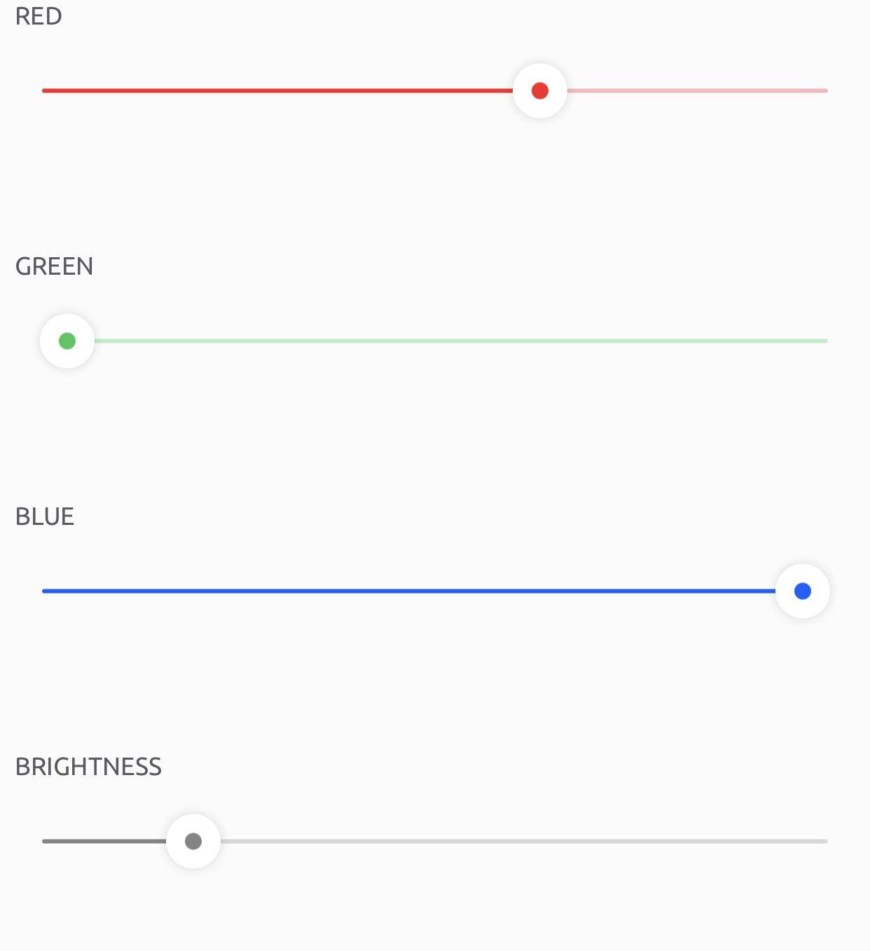
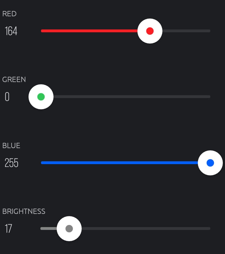
There are improvements to be made. Turn on dark mode n you see lots of flaws. We cannot read the text / numbers. The contrast is less n its not readable.