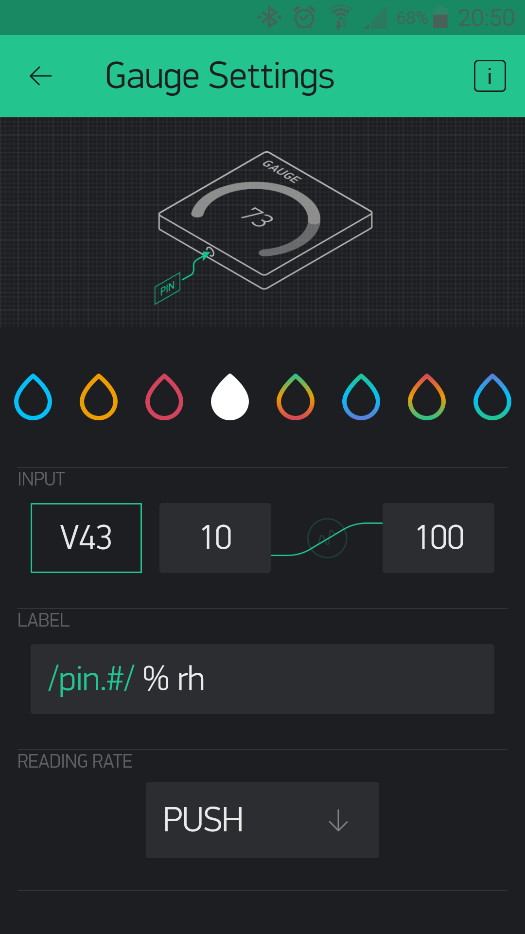
currently we have 4 dynamic color range:
- green - red
- green - blue
- red - green
- blue - green
in all 4 cases the green color represents one of the extreme (min or max). however, sometimes it would be nice to represent with green the “ok” level, i.e. the midrange of the values.
a simple example:
i would like to represent the temperature on gauge widget like this:
- blue = too cold
- green = comfortable (ok)
- red = too hot
with the current options this is not possible. i reccomend a 5th. color range: blue - red