I just noticed new buttons at the bottom of the app. Screen area is already limited by banner on the top, this makes very difficult to make an app with few widgets visible without app jumping up and down all the time, these buttons must go from bottom of the screen. If you must have them. Put them on the top bar with user and options buttons or merge them with settings menu. But not at the bottom of the screen, this is eating up usable space. Please give my suggestion a serious thought. And Help an old man.
Post a screenshot please.
1 Like
It’s not clear what screen and what buttons do you mean. Please show screenshots or explain with better wording.
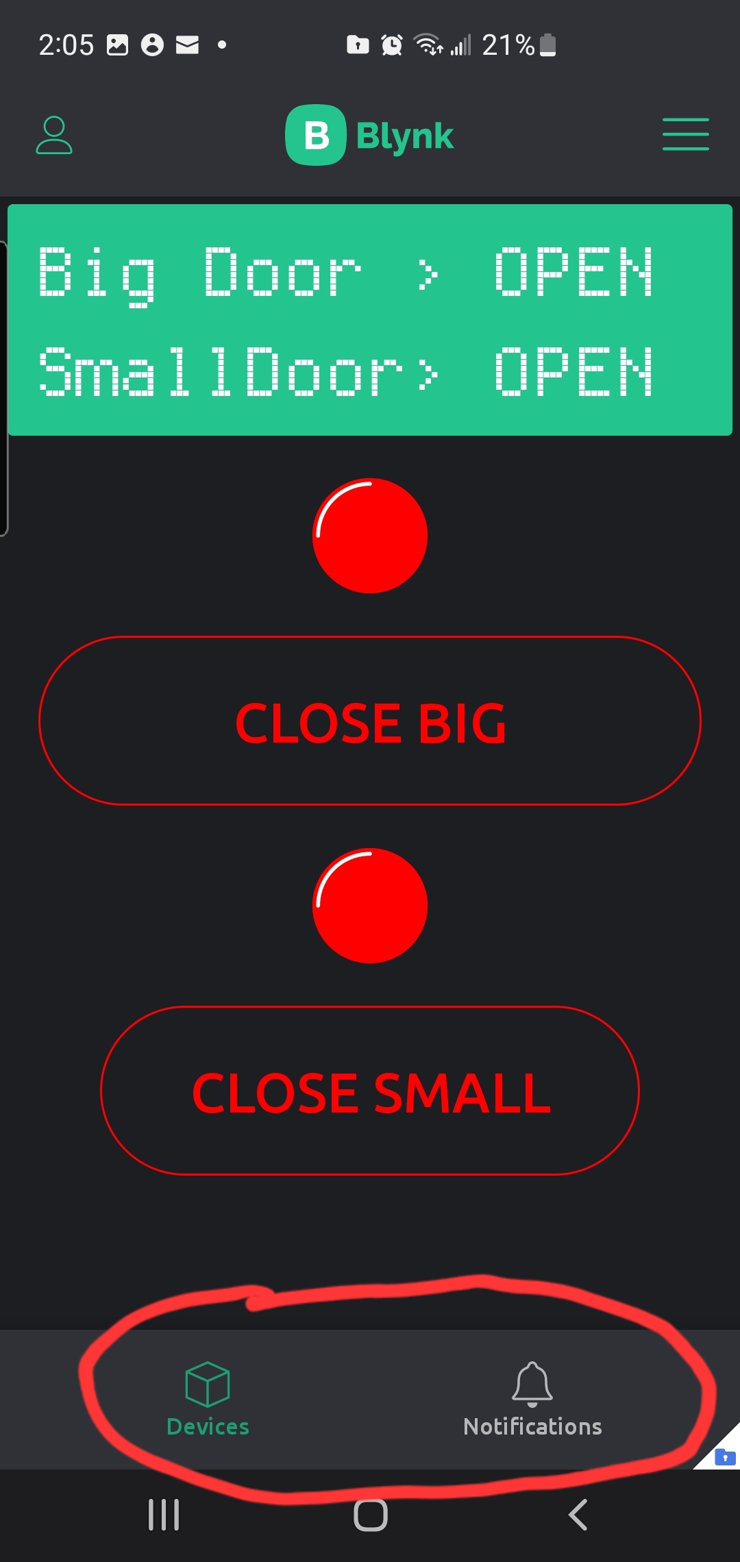
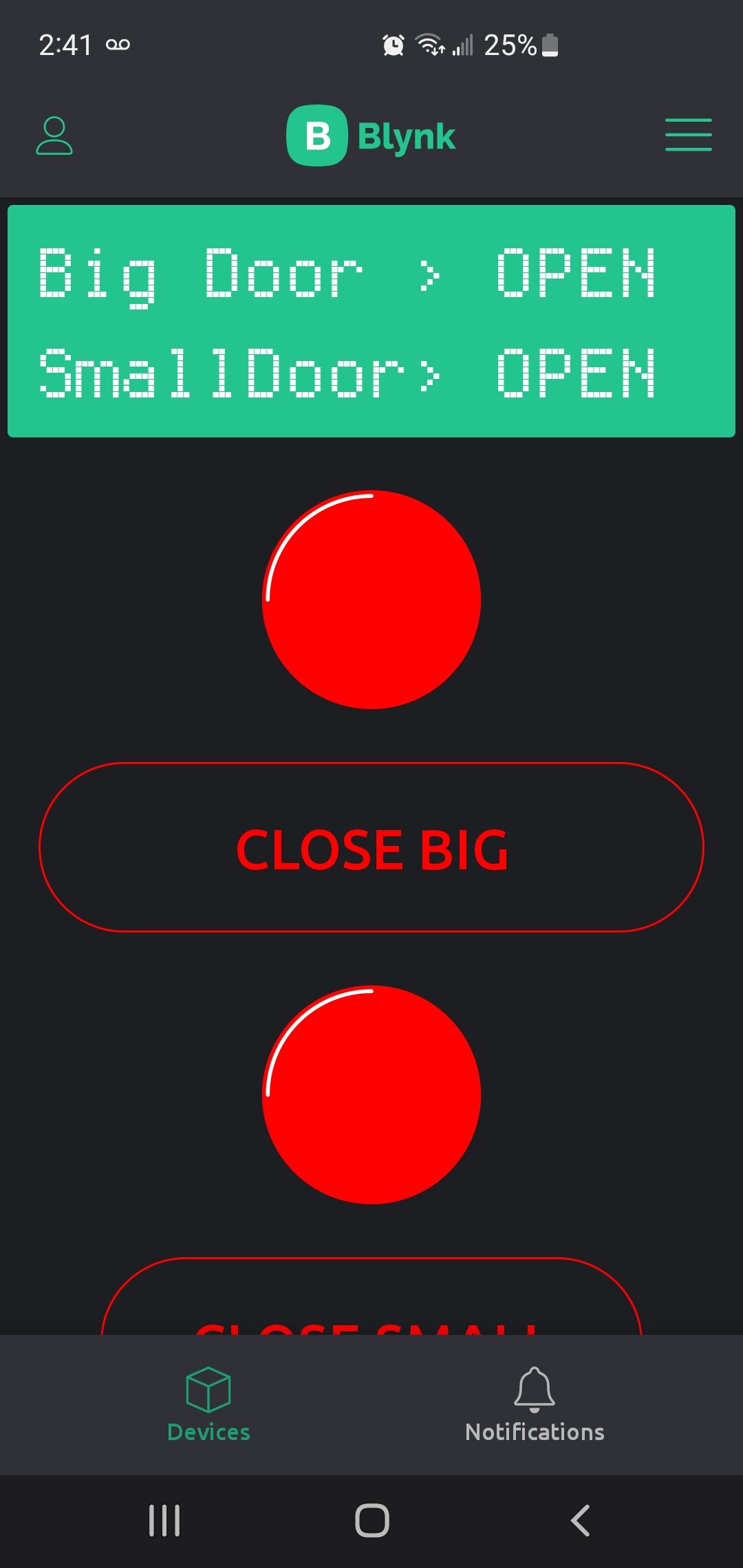
These two icons in the bottom were not there before now they appear in a panel at the bottom covering any thing under that area.
I un installed the app and reinstalled again and the icons are still there.
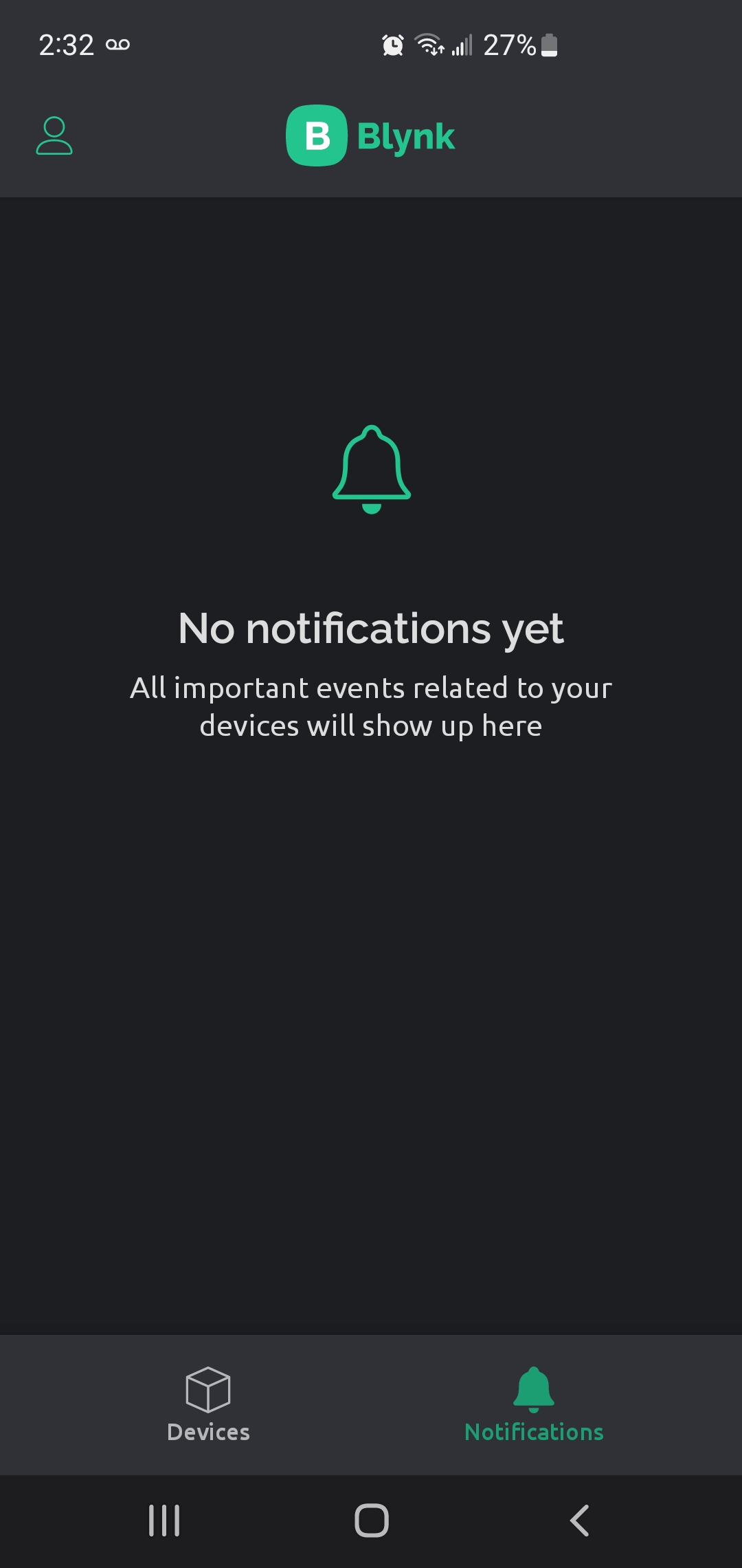
If i click notificatins icon it switches to a new page saying there are no notifications yet.
I have only one device so clicking devices does not do any thing.
No, maybe content alerts or campaign is available
We are working on single-device dashboard mode (in the next version, it will become an option in settings - so any user will be able to toggle it to enable single-device dashboard or tiles mode when only one device is available). Maybe we will move notifications to the side menu in such case.
1 Like
Thank you very much for looking in to this, moving the icons or menu to side options will be best as having one icon for one option on the main screen is not the ideal thing.