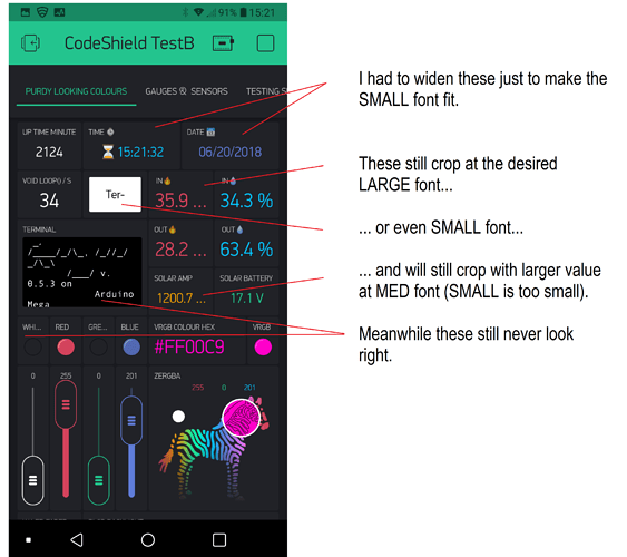
Not as good as it was before all the “fixin”… Back here I asked for a simple scalling adjustment of the small widget labels and things like the terminal text.
Those still haven’t changed but the regular text options became constrained… Now instead of text scaling to fit my desired widget size and fluctuating values… I have to adjust my widgets to fit the text limits and max values (else cropping).
End result is STILL differing sizes of text on side by side widgets (one of the justifications was unification), but less flexibility for end users choice of look.
Is it UGLY? No, not always… but neither is it better, or even the same as before.
I know ![]() but brand loyalty only goes so far… I’m not going to stare at something that doesn’t look right on my daily driver phone. Nor do I wish to adjust for “maximum air” just so I can read all the text all the time. I usually only used the phone to show others, as I rarely go anywhere.
but brand loyalty only goes so far… I’m not going to stare at something that doesn’t look right on my daily driver phone. Nor do I wish to adjust for “maximum air” just so I can read all the text all the time. I usually only used the phone to show others, as I rarely go anywhere.
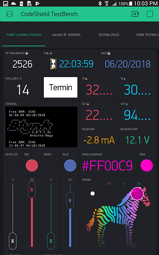
Meanwhile, tablets still work OKish for my aesthetics… not as nice as before, but workable… as in I still need to tweek individual fonts to fit without cropping…
This is the exact same project as above, but on a larger tablet, so when I reduce the fonts to fit (so much for cross device scaling), they will be relatively OK for viewability
And yes, all of this was with App v2.26.1 EDIT - oops, the tablet pic was only v2.26.0… Now it is v2.26.1… Slightly worse actually, as my terminal refresh button now can’t even display the SMALL font word Terminal ![]()
Please return the autoscale option for widget/text width ![]()

