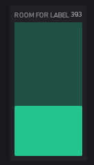
The level widget is great… I like the simplicity and the adjustability from skinny to fat, and i use a few in my projects… But for some applications a little pazzaz is wanted. That is where @Blynk_Coeur’s uniques code twists have always intrigued me. Not to replace Blynk’s look, but to accent it for those that wish.
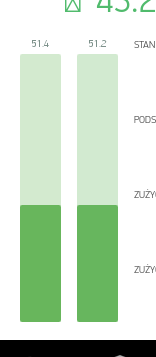
Could be little bit better- after adding labels to vertical widget. ![]()
2 Likes
They are already there… but how much could one fit on the skinny one anyhow?.. You just need to fatten them up.

2 Likes
![]() IMHO Not a good idea to place it next to the value (above would be better?)
IMHO Not a good idea to place it next to the value (above would be better?)
Moreover still some place, for “IN” and “OUT”, but the labels are not there… :
