Hi,
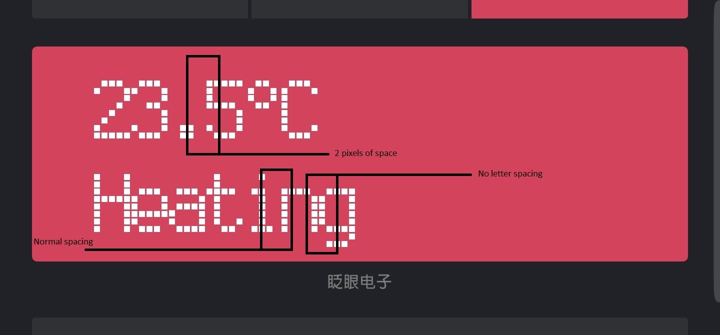
I’m using the LCD widget in a project. It is set up in a normal 2 line mode and it works fine except letter spacing which is all over the place. There are characters with too much spacing ("."), there are ones without spacing (most alphanumeric letters) and there are letters with normal (1px) spacing. This makes the whole appearance inconsistent and the text hard to read.
Can someone from the dev team check up on this, please?
Details of my setup:
• Hardware model + communication type: ESP8266 + Blynk Android 2.26.7
• Smartphone OS (iOS or Android) + version : Samsung Galaxy S8+ SM-G955F, Android 8.0.0
• Blynk server or local server: Blynk Cloud server
• Blynk Library version: 0.4.4
That’s how monospaced fonts work!
Each character is 5 pixels wide. Narrower characters such as the “.” and “i” are placed centrally (as much as possible with only 5 pixels to choose from) within the available space.
This allows easy alignment of several lines of numbers, which isn’t possible without the use of tabs when using proportional fonts.
Pete.
Hi Pete,
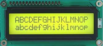
I understand your point, but if you see the character layout of a real alphanumeric LCD, it has 5x7 (5x8, or 5×10) fixed pixels per character, and it also has fixed spacing between every character. The real problem is not that some characters have more padding than the others, but that most of them doesn’t, which makes the text hard to read.
Tamas
The problem is that changing to 6 pixels per character rather than 5 would result in the character count dropping from 16 to 13, or the size of each pixel (and therefore the size of the text) reducing.
I personally don’t care either way, as I don’t use the widget, but I would guess that some existing users wouldn’t be too happy.
There are obviously alternatives widgets such as Terminal or Labelled Value (my personal choice on most situations), plus I believe there are other widgets in the pipeline that will improve choices for text display.
You could submit a proposal for modifying the existing widget here:
Pete.
I don’t think adding a little space between the caracters would affect the number of characters per line. If they’d put 16 blocks of 5x7 pixel clusters with a few DPs of spacing on a line, the problem would be solved. They can also reduce the size of the LCD pixel to fit all the 16x2 characters on the screen.
I think the cause of the issue is they use an LCD style font which doesn’t render consistently. If I were to implement the widget, I’d place the character blocks to a fixed place in the layout, and render the characters individually to their appropriate coordinates. But I understand it’s a bit more work than using regular font rendering.