I have 2 NodeMCU (ESP8266) running Blynk in 1 template. Both use Wi-Fi (2,4Ghz) 802.11n to connect to the ISP router.
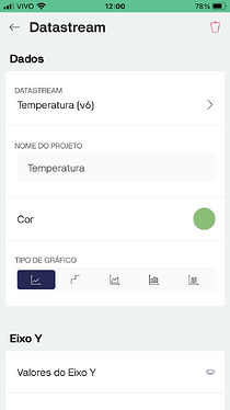
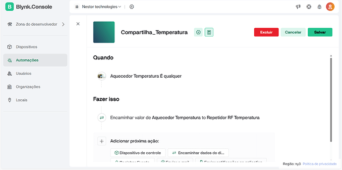
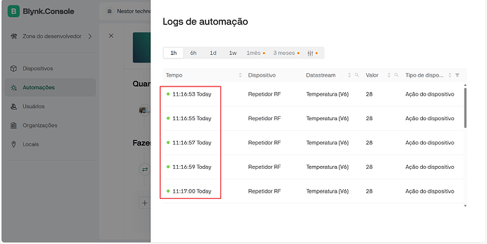
In this project, Device 1 (aquecedor) send (among others) data to Blynk server using Virtual pin 6 (temperature) every second or when the temperature changes (less than 1 second). From the server side, i have setup an automation in which Datastream (V6) is shared with Device 2 (Repetidor RF) every second.
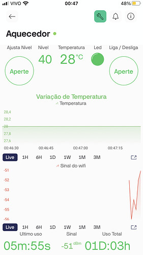
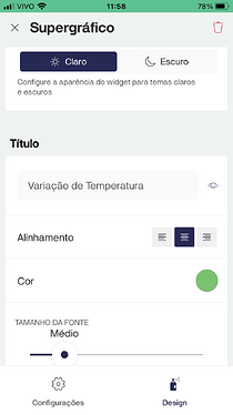
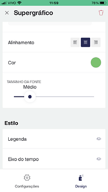
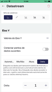
When i check Superchart widget for Device 1 (V6) using Iphone (IoS 16.7.10) in Blynk app (version 3.8.1 (1)) in live option, it’s possible to see that blynk server received 58 to 60 out of 60 (1 minute). This is great!
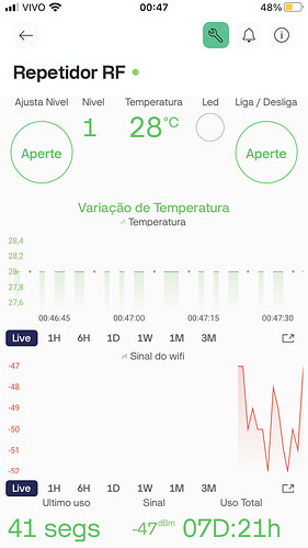
Nevertheless, when i change the tile in Blynk app to check if data has been shared with device 2, i can see a different pattern chart, in a Morse Code style as if some data is missing randomly.
As to make sure it was not only a chart issue, i’ve insert a integer variable (to add each reception) and a unsigned long variable (to calcule time between receptions) inside BLYNK_WRITE(V6) in Device 2 Sketch. Also, i’ve insert a Serial.println to show time interval betwwen those receptions. The results were quite similiar to what was showed in Device 2 Superchart.
Trying to solve it myself, i have tested some changes in Blynk Timer for Device 1. First, i reduced interval to 900L (0,9 seconds). The amount of received data in Device 2 dropped to less than 30 out of 60. Before that, i had an average (39 to 40 - out of 60). By increasing interval to 1100L (1,1 seconds), the amount of received data had an impressive increase to 57 to 59 - out of 60.
Why i believe there is a bug in Automation? Because i almost solved it by change the frequency data is sent to the server. There seems to be something in Automation that drops data if it doesn’t arrive to the server in a expected frequency.
When i check Automation icon in the Smartphone or Blynk.Console, i can see it running every minute (it’s not possible to see if its running every second).
I have recorded a 1 minute clip from Smartphone Screen in which it’s possible to see the difference between the 2 Devices’s Superchart (green chart). Unfortunately, i couldn’t attach it to this topic.
Moreover, I’ve decided not to share both sketches at first, as they have over 1000 lines (device 1) and 500 lines (device 2). Both devices are using Blynk Library 1.3.2.
