When setting CUSTOM time range for a graph in the Web Dashboard the data will be AVERAGEd and not detailed with high res.
Q: Is there a way to set a custom time range and display graph data in high res, or detailed?
Background:
I can view graph data in 1 week range in high res and I can view in 1 month range in high res. But if I set customer time range between (as example) March 13 to April 1) which is less than 1 month, the displayed data is no longer in high res but plotted as “daily average”.
I really would like to keep the detailing/high res but just set a specific time range.
I see AVG, MIN and MAX only.
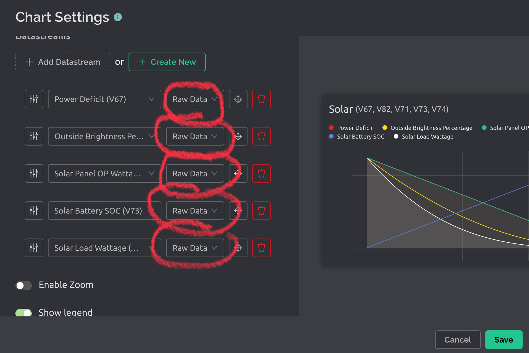
Then I enabled “Save Raw Data” in the Datastream Edit.
Now I can see the RAW DATA also.
OK.
But,
It seems all the earlier saved data is erased by this operation. So now I have lost all recorded data so far …
Turning back, and disabling RAW DATA, did not get it back.
Looks like Enable Raw Data will enable you to see it detailed but it also erases all old data.
I was wrong about my conclusion above.
The data “seemed” to be removed as I still had the “Raw data” still selected in the graph settings after I disabled the “save raw data” in the Datastream Edits.
So, in a way, I was trying to plot/display raw data that was disabled.
=>
When switching to raw data, old avg data is not seen (in raw data mode).
Avg data is kept and will be seen again when properly disabling “save raw data” (in Datastream) AND selecting AVG (in dashboard graph).