Dear all,
within next few weeks we will drop support for the old History Graph widgets. If you still using it - please use the SuperChart instead. Sorry for inconveniences.
We need to move forward.
Dear all,
within next few weeks we will drop support for the old History Graph widgets. If you still using it - please use the SuperChart instead. Sorry for inconveniences.
We need to move forward.
I will miss a bit the “professional look” of those old history graphs. Superchart looks “cool” (and is far better), but this grid just keeps me still using them… 
Gonna miss the simplicity of history graph…
Agree. I already proposed to Pavel to make the simple version of SuperChart.
Why get rid of a widget if its working ?
While I think that the super chart widget is fantastic its not going to be wise to just have one chart.
This change wiped out my beautiful screen layouts.
Because it uses old code base we want to get rid of. Old code adds additional maintenance cost.
ok.
I will adapt
Dears,
kindly explain how to setup a common dynamic Y-scale for many datastreams in single Super Chart
i mean Ymin should me minimal value of any datastream, and Ymax should be maximum from any datastream
at the moment, i can configure following modes:
so kindly help how to configure that New, Code-optimized and Fancy looking SuperChart widget. Idea is to have singe Y-axis that adopts to absolute min/max values by itself instead of (N) different vertical scales
Best Regards,
Serge
Override auto scaling for all data streams option does what you need.
There is a labelling issue when enabled, but will be fixed. At some point.
Thanks, exactly what i asked for 
@Developers, what do you think about vertical/horisontal grid lines, is it possible to realize?
This is why I stopped growing up long ago… ![]() … Getting old is a detriment to your existence, whether you are old code or an old coder(wannabee)
… Getting old is a detriment to your existence, whether you are old code or an old coder(wannabee) ![]()
![]()
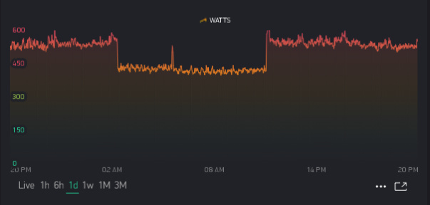
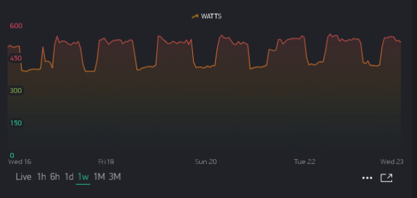
well, the daily values seem close the the actual values, but the weekly chart shows nothing at all like the daily values?
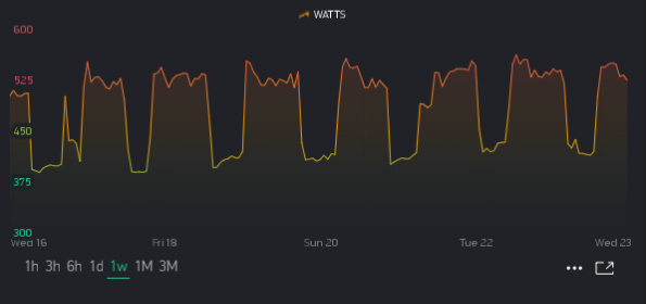
on the old history graph, the weekly chart would be 7 peaks and troughs, not one smoothed out line.
Like this?


What visual information are you looking for on a weekly view? Considering that your daily chart is rather sloping in the first place, your weekly view seems on par…without knowing what prior days looked like at least.
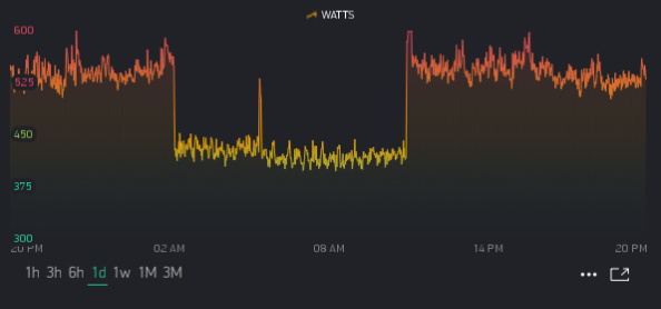
It seems your MIN/MAX ranges where tighter in the old charts then in your new one… Try adjusting the new one for a tighter and thus more prominent view?
For example, instead of 0-600 I now set for 300-600

