I would love it if I could store some array data in chart form with custom x labels instead of being locked into the default time scales of hours, days, weeks, etc… And instead of needing a data stream, you could send the chart an array of values that would show up in the chart as a bar or line graph. And finally if this was available in the free plan.
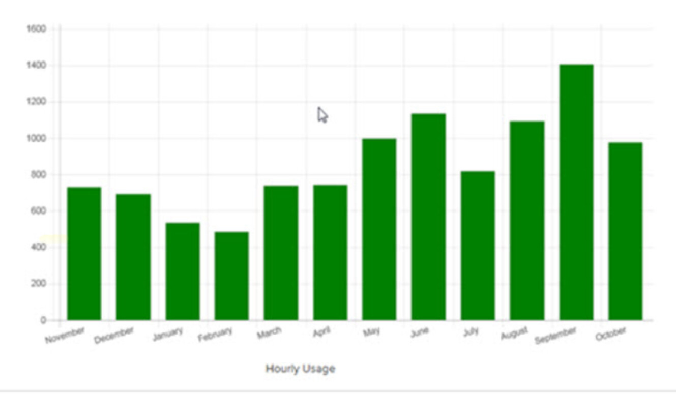
For instance, I want to have a bar graph of month totals that the device could update one or all of the monthly values at the end of the month by sending the widget an array of values. The x axis labels would be customized to be Jan, Feb, Mar, Apr…Dec.
Thanks Pavel. I did see simple chart was released, but couldn’t find a whole lot of details about it. I also don’t have a paid plan so unfortunately I can’t play around with it. Does it have the ability to have months on the x axis? Like this…
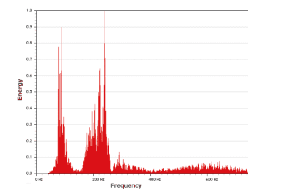
Quick additional question: what about X-axis values other than time, such as “buckets” representing, say, frequency spectrum, with Y-axis representing magnitude? Something like this:
Currently all of our charts are time-based. Having other dimensions is interesting, but these requests were extremely rare both from community and from businesses. Most likely this will be “saved for later”