This sounds similar to something I’m doing with my little solar power generating system that is used for my outdoor lighting system.
I interrogate my solar controller every six seconds (makes the maths easier) and get the latest load wattage and latest solar panel output wattage. As well as writing these values to my chart widget, I accumulate daily running totals for these readings and divide the results by time to give me watt/hour values.
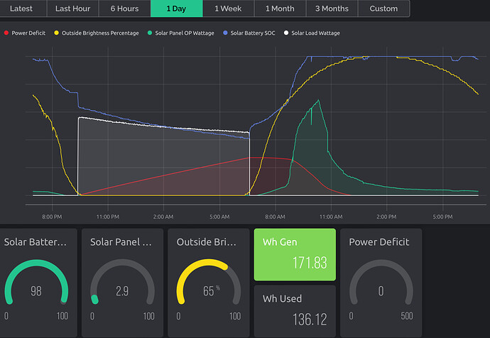
In the screenshot below, the white line/area is the load and the green line/area is the power generated.
The values shown below (Wh Used and Wh Generated) are the sum of the readings over time. This, in effect, gives me the area below the two curves and allows me to compare one with another despite the “curves” being very different shapes…
I do all of this in Node-Red, because the data goes via Node-Red anyway and it’s the simplest way to do things for me, but you could do a similar thing on your MCU.
Note to self - time to re-visit my web dashboard and tidy-it up!
Edited to add, the scales on the power used an power generated datastreams are different, which is why the areas below the curves don’t visually appear to back-up the numbers.
Pete.
