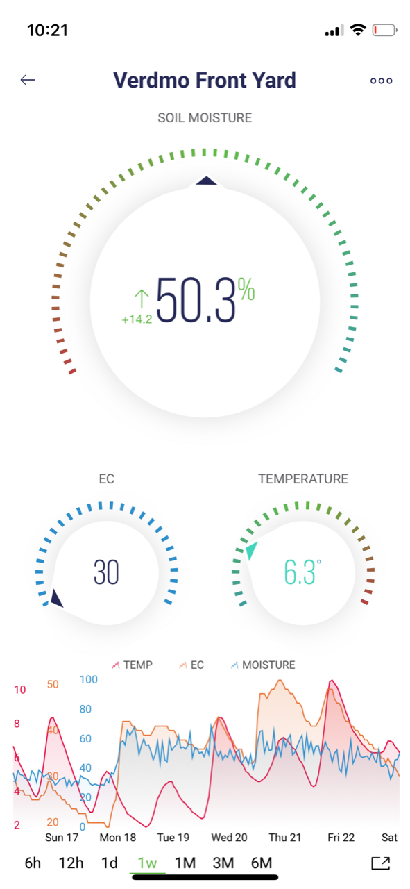
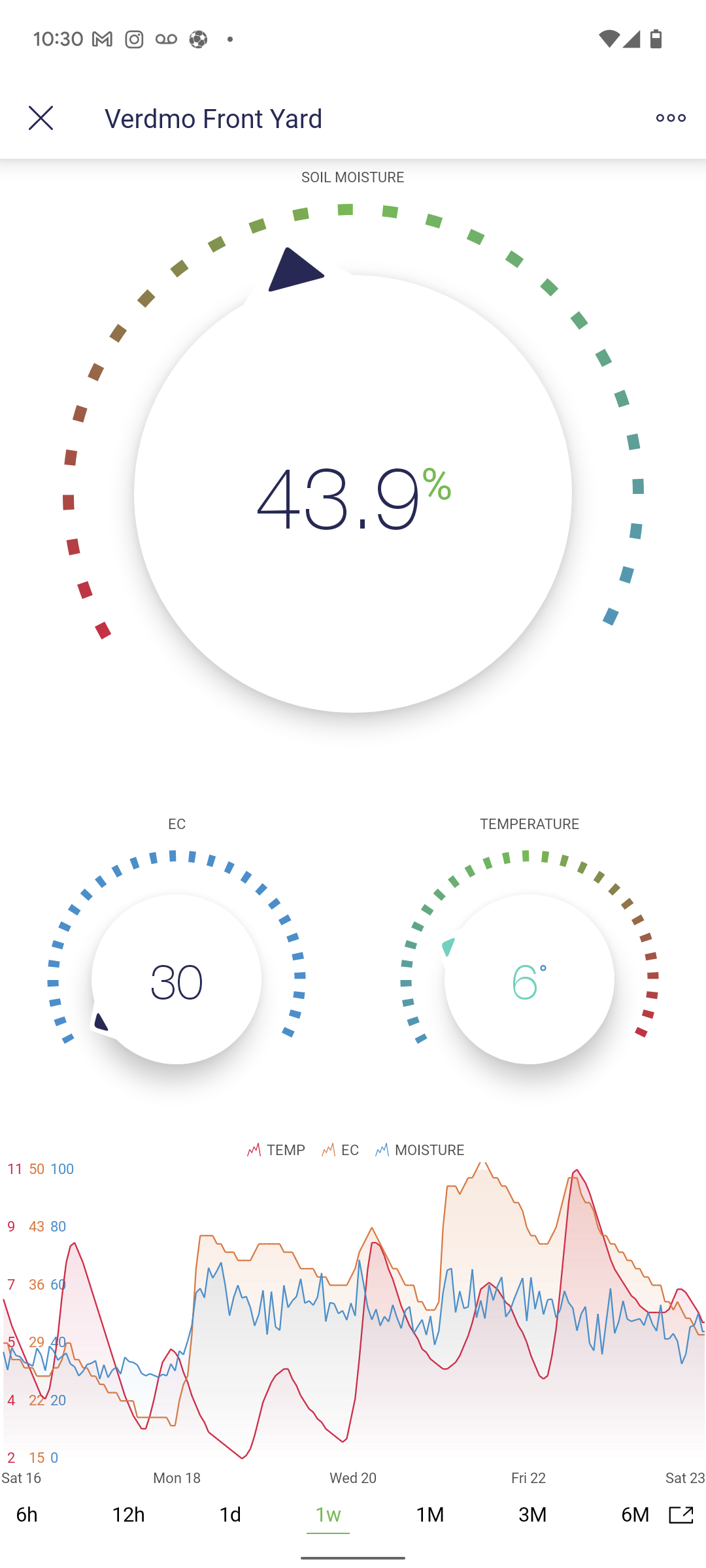
I have done most of the development using an Android phone (Pixel 6). The app looks very clean and crisp in my opinion. I just now tested using an iPhone (12 Mini I believe) and it honestly looks worse. Is this possibly because the 12 Mini is so small?
I could try making some changes to the appearance (text size, etc), but I’m worried it will make the Android version look worse.
I guess the main issues is with the super chart. The axis levels are spread out further, and the time selection on the bottom isn’t equally spread across the screen.
Is this just me being overally picky? It could be!!
iOS on left, Android on right