Hi Blynk Team.
I am a hobbyist developing for both iOS and Android.
iOS is an iPad running iPadOS 17.1.2, Blynk App 3.6.6 (1)
Android is a Pixel 6a running Android 14, Blynk App 1.14.4 (170).
These examples are using Blynk 1.3.2 on an ESP32.
When I label Blynk widgets, the text often renders differently in Android and iOS so that they look bad on at least one platform.
Examples below are for Styled Buttons.
-
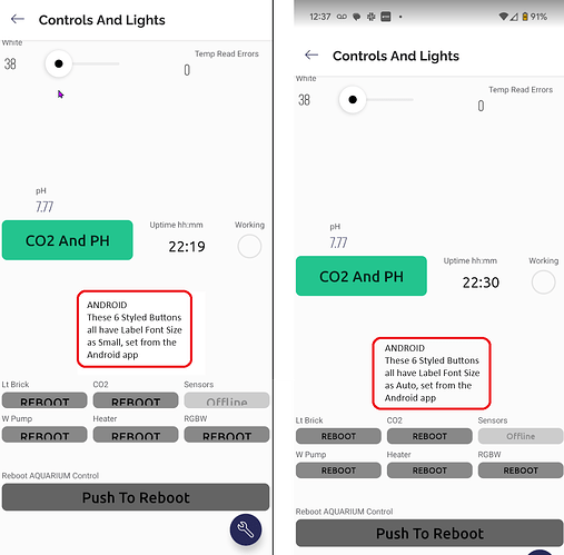
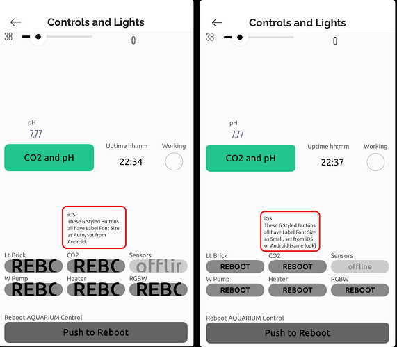
When I use the Auto Label font size from Android, it looks great on Android, but bad on iOS. See below.
-
When I use the Small Label font size on iOS or Android, it looks bad on Android, good on iOS. See below.
My expectation is that using the Auto Label Font Size works for BOTH Android and iOS.
It would be nice if these worked better with each other so that we can develop for both platforms with the same Blynk apps.
I am happy to help if asked.
Thanks for looking into this. Much appreciated.
Screen shots below focus on the 6 Styled Buttons at the bottom of the screen.
Android Screen shots
LEFT uses Label Font Size Small , set from iOS
RIGHT uses Label Font Size Auto, set from Android
iOS Screen shots
LEFT used Label Font Size Auto, set from Android
RIGHT uses Label Font Size Small, set from iOS

