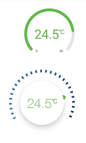
I think enhanced gauge should have bold font 
What they’re not busy enough? 
The old gauge should have the not bold font)
We will refresh widgets padding/fonts/UI with app design rework and make them having a more consistent UI - as it will be ready for some beta, I will share it via beta/preview list users.
1 Like
Thank you Alexander 
How to become beta tester on Google play?
I suppose you should be already on the list. Have you been in the early access? I will later create a separate Open Beta, as in the legacy Blynk app.
Yes I was in the first access and I was beta tester with Blynk legacy app
1 Like
