Hello,
I updated my server & app to the new versions 2.16.4.
I can display the Y axis but the limits are just displayed on the 4 corners. Not very nice…
I viewed here that they were displayed as min/max of each variable.
Why not in my case?
Hello,
I updated my server & app to the new versions 2.16.4.
I can display the Y axis but the limits are just displayed on the 4 corners. Not very nice…
I viewed here that they were displayed as min/max of each variable.
Why not in my case?
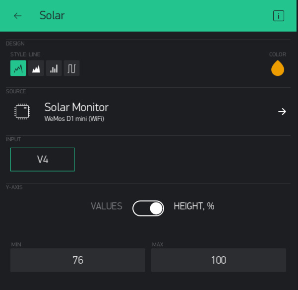
I have my chart elements set at Height, % settings (each in it’s own 1/4 space), whereas yours looks like they may be set for Values (all share the same space).
Yeah!
I think the displayed data in between MIN & MAX (total of 2-4+ points of range seems normal) is determined by variance of data within the chosen time range. And making a chart tall will only accentuate that effect.
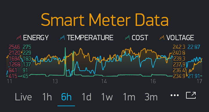
@Gunner see screenshot (cropped portrait not landscape). This is using 100% for each of the 4 variables and the only one with only 2 y-axis values during the 6 hours is temperature and that’s because it only varied between 21.91 and 22.87. Surely @Alx-I should see something similar.
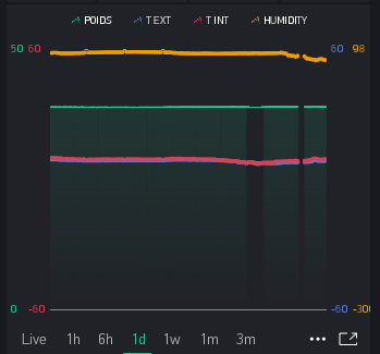
Note the “Gunner Chart bug”.
Now who’s chart looks gruesome ![]()
His ranges are all flatlined… not many differences to account for.
Might have been nice to have a single data point for where the actual line is though.
What bug… the looking into the future bug? I haven’t actually noticed it myself.
No another bug, the one that makes my chart look gruesome ![]()
y-axis data points in portrait mode that run straight through the data on the left and right side of the screen.
Ahhh… but dare I ask why it is called the “Gunner Chart bug”? 
because Gunner pushed for the y-axis data points.
Ha Ha… they never listen to me… must have been someone else 
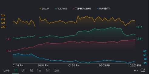
Strange that it does that on your chart only… And the x-axis looks different, I don’t think you have the latest chart revisions in your ESPproMon App (I recall you saying something about that I think).
Mine is a special chart i.e the app variety.
@Alx-I I notice this thread is marked solved, is it really solved and if so how did you fix the problem?
Hi Costa, I just applied the config of gunner (% height) and I have now a clear view of each stream of data.
It’s all I needed 
I think also that the flattening of my charts doesn"t help the display to show nice range of Y axis in absolute mode…