Please don’t tag people without a need. We monitor all the topics. Tagging doesn’t help, it actually works the opposite.
Thanks for understanding.
Please don’t tag people without a need. We monitor all the topics. Tagging doesn’t help, it actually works the opposite.
Thanks for understanding.
Ok
But why you keep “taging” in the forum
I think it is an option that you can remove easily.
That would be like removing a doorbell just becasue one person keeps ringing it unnecessarily 
if the door was opened i will never ring a bell
I had an issue that you developers can’t find a solution
Dmitriy answer was : " That’s correct. If there is no space we do not scale text. This is by design."
for Blynk I never thought that it was a resolution problem.
3 years ago after 4K mobile phone appears on the market many applications stops working or shows differently.
it takes time for developers to readjust there programs on google play to run on 4K phones
at that time i began to use Game Tuner so I could run my preferred app.
now I am not using it any more.
if I tag marvin7 is because he is using NOTE4 too.
and if I tag you developers Pavel, Dmitriy, Gunner it was to say I found the problem, the problem is with the 4k resolution and I hope you can fix it.
but unfortunately you developers answer was, don’t ring the bell again.
“Tagging doesn’t help, it actually works the opposite.”
I hope I made my self clear
thanks any way
The “door” (this topic) was already opened, you already stated your issue… so did others… so no need to keep “ringing” as we are already at the same party (this topic) 
The developers are busy, but they are aware of our posts (including this topic )… and if there is an actual issue, then they will correct it when they can. Free has its benefits… rush service is not always one of them 
Until then, please be patient, follow the guidelines and instruction without unnecessary arguing/justification and most of all… relax
Clear? <-- rhetorical question… no need to answer 
@Gunner isn’t one of the developers, he’s a keen user like many of us on this forum.
Between us we try to answer questions whet we can, as well as sharing interesting stuff we’ve done with Blynk. This helps the developers and the owners of the product to focus on the important stuff - making money and improving the product, whilst hopefully expanding the user base by ensuring that newcomers don’t fall at the first hurdle.
The Blynk staff monitor this forum and will chip-in with answers if necessary, so it’s not good to keep tagging them in posts. Once you’ve realised that your problem is one of screen resolution, that the Blynk developers are aware of it, and that there are 3rd party solutions out there then it would be better to implement that solution and move-on.
A bit of a reality check is soon going to tell you that an app with fixed fonts isn’t going to be able to run the same way on a massive range of screen sizes and resolutions, no matter how much the Blynk developers, and users, would like it to. If you want the app to look the same on every size of device then buy a few iOS devices - but don’t complain about the fact that larger devices use the 1x scaling option.
Pete.
Too bad… I am becoming multilingual… I can totally mess up code in BASIC, C++, NodeJS and even a wee little bit of Python (OK, mostly I can barely spell Python… but baby steps ![]() )
)
EDIT I guess I can add Linux… but that one just makes me mad… been fixing my RPi all day ![]() … but I actually just fixed it.
… but I actually just fixed it. ![]() … still dislike Linux though.
… still dislike Linux though.
hehe… For me linux is like a water: impossible to live without it, but from time to time it may flood you almost to drown you ![]()
Not that long time ago nVidia drivers almost killed my Ubuntu… ech…
Yes, thank you! ![]()
EDIT:
Hmm… The only result after using it, is a decreased resolution. Scaling hadn’t changed a bit in my case. Look at extreme settings: 100% and 25%
try using “Device Tiles” with text at 100 % and at 75% and you will get the difference.
I will remember that. Currently not using those. This whole Android UI management is weird for me. Even devices using the same resolution can have drastic differences in UI look.
After a couple of days of playing with Blynk app on IOS, after I managed to make myself a server (even if I payed for max. energy package lol), I noticed a “shrink” in the widgets area.
Before, there were no margins around it, “spreading” to the entire screen.
Now that is gone and those margins are there.
Also it is more flat (the bevels are almost gone).
I thought is just me, but looking on utube at other videos I am right.
Did devs played around with it and “lost” some bolts? :))
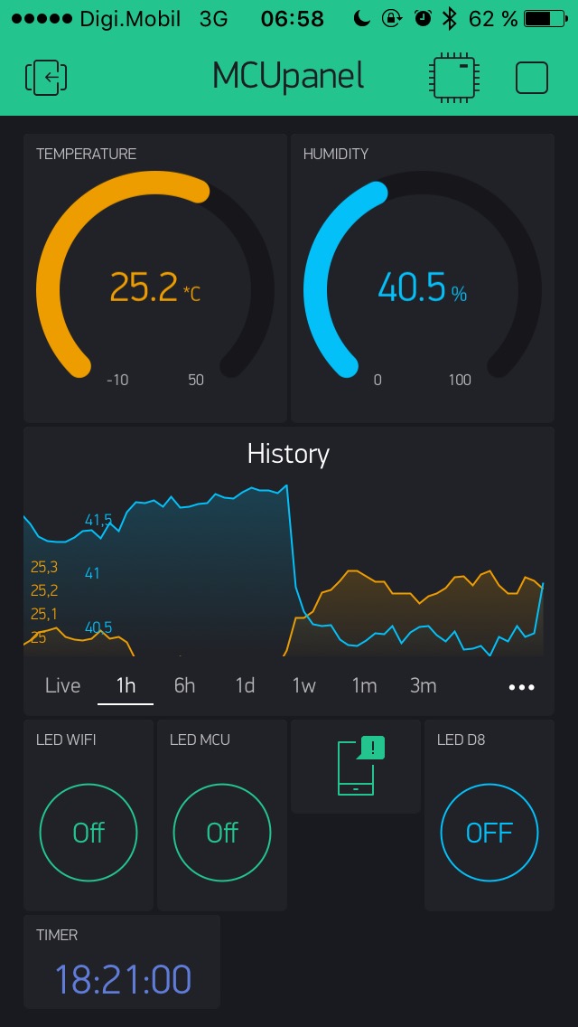
This is my screen now.
Why the change?
@kriss13 I moved your post into another related and pre-existing topic…
The UI is constantly changing… I guess to accommodate things like scrolling, new phones, new OS, future upgrades, etc… but hard to tell if any issues are due the App changes or the massive variety of phones, screens, resolutions, etc.
Can you be more specific on the UI issue you are seeing? Your screenshot looks “normal” to me.
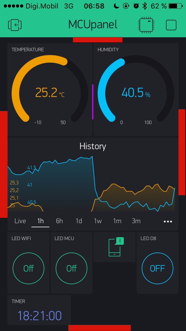
I marked them in red.
That distance between end of the widgets and the edge of screen was “hair line” (marked in purple).
The “tiles” where edge to edge, in sync with the space between tiles themselves ( marked in purple between gauges)).
I am a graphic designer… these things “scream” at me the moment I see them and this make the
difference between polished UI and “meh” UI. Don’t get me wrong, Blynk is looks very polished and styled, that is why I point this out… to help you keep it that way 
ps
This is on iPhone 5, IOS 10.3.3.
It was always like that. I’m a graphic designer who made all the screens, so I know for sure)
Well I can’t speak for the iOS App… I am an Android user (can’t even afford to look as an Apple device ![]() )
)
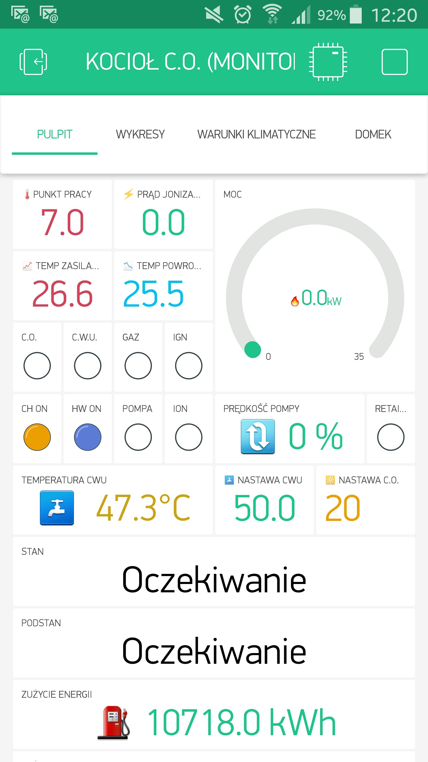
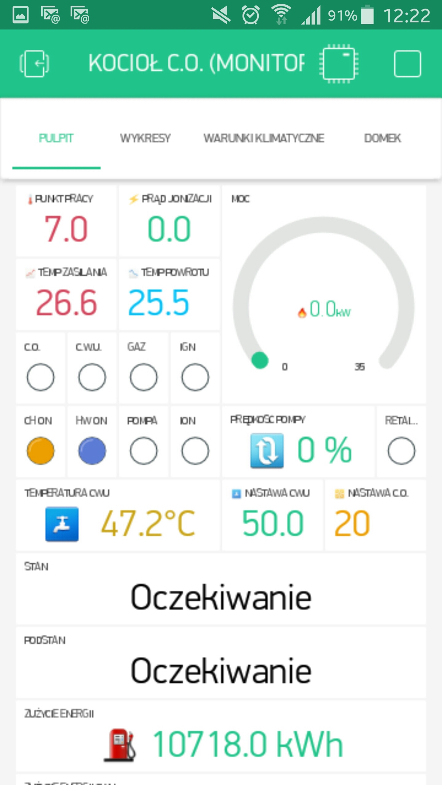
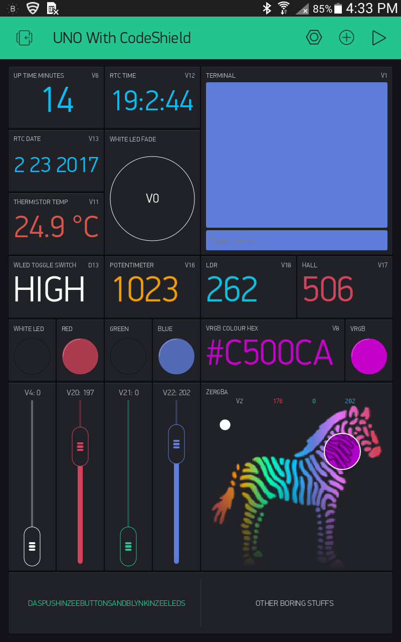
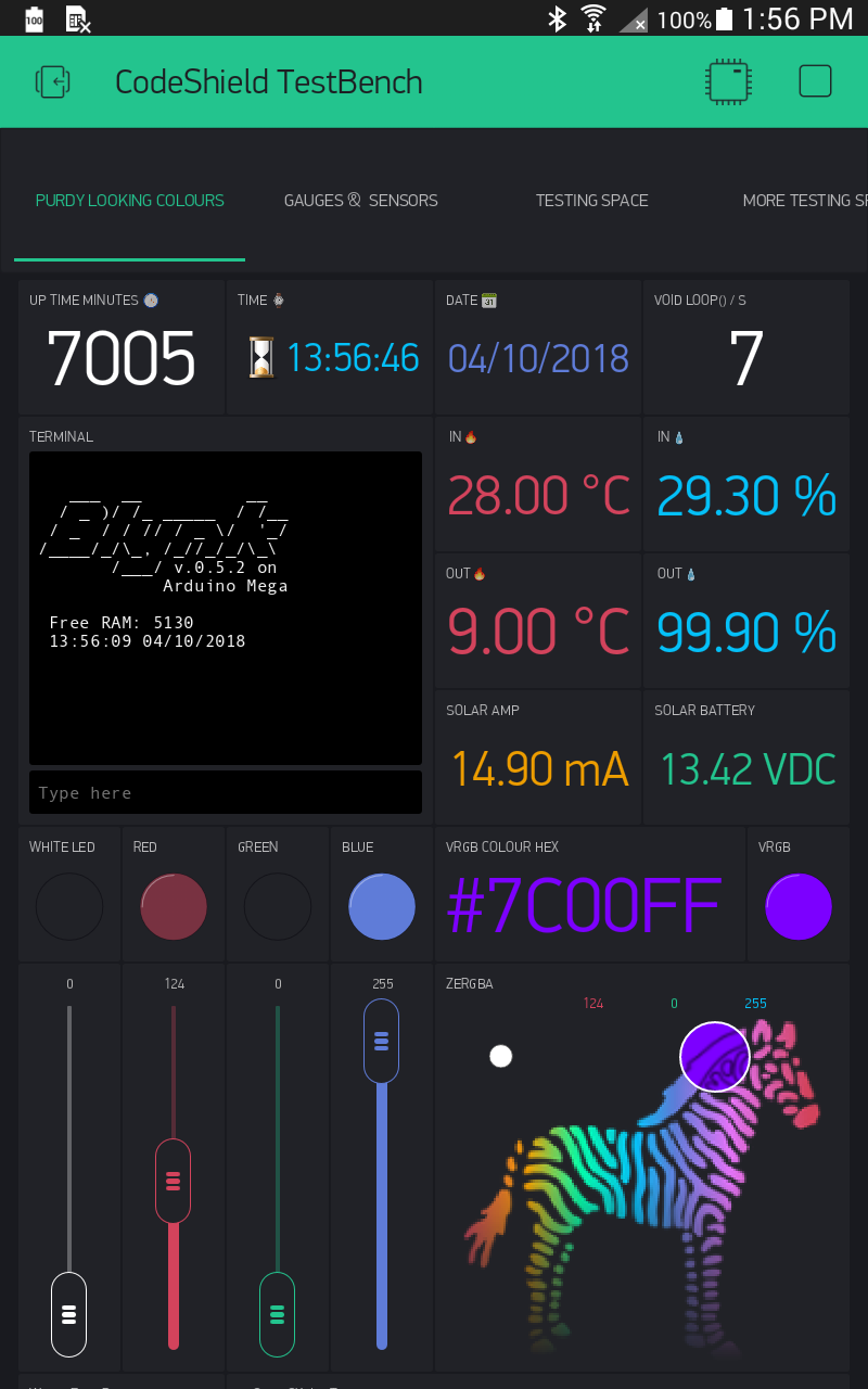
This is the earliest saved screenshot I have on file… Feb 23, 2017… And same device, current screenshot (today)
I see a subtle shift in the very background (border) colour as it is a shade lighter now. And that helps blend in the tiling (a good thing in my view as a graphic viewer ![]() ). And some necessary difference in top and bottom margins due to Tabs now integrated into top and the addition of vertical scrolling (I have more widgets below).
). And some necessary difference in top and bottom margins due to Tabs now integrated into top and the addition of vertical scrolling (I have more widgets below).
But otherwise, as you can see, the side margins and borders are the same size back then as they are now.
Yup, looks like it.
I did a google search to find others on IOS, same margins.
Maybe is just me… 
We will be soon removing margins and changing layout a bit